Summary
In this blog we explain most valuable evaluation plots to assess the business value of a predictive model. Since these visualisations are not included in most popular model building packages or modules in R and Python, we show how you can easily create these plots for your own predictive models with our modelplotr r package and our modelplotpy python module (Prefer python? Read all about modelplotpy here!). This will help you to explain your model's business value in laymans terms to non-techies.
Intro

‘...And as we can see clearly on this ROC plot, the sensitivity of the model at the value of 0.2 on one minus the specificity is quite high! Right?…’.
If your fellow business colleagues didn’t already wander away during your presentation about your fantastic predictive model, it will definitely push them over the edge when you start talking like this. Why? Because the ROC curve is not easy to quickly explain and also difficult to translate into answers on the business questions your spectators have. And these business questions were the reason you’ve built a model in the first place!
What business questions? We build models for all kinds of supervised classification problems. Such as predictive models to select the best records in a dataset, which can be customers, leads, items, events... For instance: You want to know which of your active customers have the highest probability to churn; you need to select those prospects that are most likely to respond to an offer; you have to identify transactions that have a high risk to be fraudulent. During your presentation, your audience is therefore mainly focused on answering questions like Does your model enable us to our target audience? How much better are we, using your model? What will the expected response on our campaign be? What is the financial impact of using your model?
During our model building efforts, we should already be focused on verifying how well the model performs. Often, we do so by training the model parameters on a selection or subset of records and test the performance on a holdout set or external validation set. We look at a set of performance measures like the ROC curve and the AUC value. These plots and statistics are very helpful to check during model building and optimization whether your model is under- or overfitting and what set of parameters performs best on test data. However, these statistics are not that valuable in assessing the business value the model you developed.
One reason that the ROC curve is not that useful in explaining the business value of your model, is because it’s quite hard to explain the interpretation of ‘area under the curve’, ‘specificity’ or ‘sensitivity’ to business people. Another important reason that these statistics and plots are useless in your business meetings is that they don’t help in determining how to apply your predictive model: What percentage of records should we select based on the model? Should we select only the best 10% of cases? Or should we stop at 30%? Or go on until we have selected 70%?... This is something you want to decide together with your business colleague to best match the business plans and campaign targets they have to meet. The four plots - the cumulative gains, cumulative lift, response and cumulative response - and three financial plots - costs & revenues, profit and return on investment - we are about to introduce are in our view the best ones for that cause.
Installing modelplotr
Before we start exploring the plots, let's install our modelplotr package. Since it is available on CRAN it can easily be installed. All source code and latest developments are also available on github.
install.packages('modelplotr')
Now we're ready to use modelplotr. In the package vignette (also available here) we go into much more detail on our modelplot package in r and all its functionalities. Here, we'll focus on using modelplotr with a business example.
Example: Predictive models from caret, mlr, h2o and keras on the Bank Marketing Data Set
Let's get down to business! Our example is based on a publicly available dataset, called the Bank Marketing Data Set. It is one of the most popular datasets which is made available on the UCI Machine Learning Repository. The data set comes from a Portugese bank and deals with a frequently-posed marketing question: whether a customer did or did not acquire a term deposit, a financial product. There are 4 datasets available and the bank-additional-full.csv is the one we use. It contains the information of 41.188 customers and 21 columns of information.
To illustrate how to use modelplotr, let's say that we work as a data scientist for this bank and our marketing colleagues have asked us to help to select the customers that are most likely to respond to a term deposit offer. For that purpose, we will develop a predictive model and create the plots to discuss the results with our marketing colleagues. Since we want to show you how to build the plots, not how to build a perfect model, we'll only use six of the available columns as features in our example. Here’s a short description on the data we use:
- y: has the client subscribed a term deposit?
- duration: last contact duration, in seconds (numeric)
- campaign: number of contacts performed during this campaign and for this client
- pdays: number of days that passed by after the client was last contacted from a previous campaign
- previous: number of contacts performed before this campaign and for this client (numeric)
- euribor3m: euribor 3 month rate
Let's load the data and have a quick look at it:
# download bank data and prepare

#zipname = 'https://archive.ics.uci.edu/ml/machine-learning-databases/00222/bank-additional.zip'
# we encountered that the source at uci.edu is not always available, therefore we made a copy to our repos.
zipname = 'https://modelplot.github.io/img/bank-additional.zip'
csvname = 'bank-additional/bank-additional-full.csv'
temp <- tempfile()
download.file(zipname,temp, mode="wb")
bank <- read.table(unzip(temp,csvname),sep=";", stringsAsFactors=FALSE,header = T)
unlink(temp)

bank <- bank[,c('y','duration','campaign','pdays','previous','euribor3m')]

# rename target class value 'yes' for better interpretation and convert to factor
bank$y[bank$y=='yes'] <- 'term.deposit'
bank$y <- as.factor(bank$y)

#explore data
str(bank)
## 'data.frame':    41188 obs. of  6 variables:
##  $ y        : Factor w/ 2 levels "no","term.deposit": 1 1 1 1 1 1 1 1 1 1 ...
##  $ duration : int  261 149 226 151 307 198 139 217 380 50 ...
##  $ campaign : int  1 1 1 1 1 1 1 1 1 1 ...
##  $ pdays    : int  999 999 999 999 999 999 999 999 999 999 ...
##  $ previous : int  0 0 0 0 0 0 0 0 0 0 ...
##  $ euribor3m: num  4.86 4.86 4.86 4.86 4.86 ...
On this data, we've applied some predictive modeling techniques. To show modelplotr can be used for any kind of model, built with numerous packages, we've created some models with the caret package, the mlr package, the h2o package and the keras package. These four are very popular R packages to build models with many predictive modeling techniques, such as logistic regression, random forest, XG boost, svm, neural nets and many, many others. When you've built your model with one of these packages, using modelplotr is super simple.
mlr, caret, h2o and keras provide numerous different algorithms for binary classification. It should be noted, that to use our modelplotr package, you don't have to use one of these packages to build your models. It's just a tiny bit more work to use modelplotr for models created differently, using R or even outside or R! More on this in the vignette (see: vignette(modelplotr) or go here. For now, to have a few models to evaluate with our plots, we do take advantage of mlr's/caret's/h2o's/keras' greatness.
# prepare data for training and train models
test_size = 0.3
train_index =  sample(seq(1, nrow(bank)),size = (1 - test_size)*nrow(bank) ,replace = F)
train = bank[train_index,]
test = bank[-train_index,]

#train models using mlr...
trainTask <- mlr::makeClassifTask(data = train, target = "y")
testTask <- mlr::makeClassifTask(data = test, target = "y")
mlr::configureMlr() # this line is needed when using mlr without loading it (mlr::)
task = mlr::makeClassifTask(data = train, target = "y")
lrn = mlr::makeLearner("classif.randomForest", predict.type = "prob")
rf = mlr::train(lrn, task)

#... or train models using caret...
# setting caret cross validation, here tuned for speed (not accuracy!)
fitControl <- caret::trainControl(method = "cv",number = 2,classProbs=TRUE)
# mnl model using glmnet package
mnl = caret::train(y ~.,data = train, method = "glmnet",trControl = fitControl)
## Warning in load(system.file("models", "models.RData", package = "caret")):
## strings not representable in native encoding will be translated to UTF-8

#... or train models using h2o...
h2o::h2o.init()
## Warning in h2o.clusterInfo():
## Your H2O cluster version is too old (3 months and 27 days)!
## Please download and install the latest version from http://h2o.ai/download/
h2o::h2o.no_progress()
h2o_train = h2o::as.h2o(train)
h2o_test = h2o::as.h2o(test)
gbm <- h2o::h2o.gbm(y = "y",
                    x = setdiff(colnames(train), "y"),
                    training_frame = h2o_train,
                    nfolds = 5)

#... or train models using keras.
x_train <- as.matrix(train[,-1]); y=train[,1]; y_train <- keras::to_categorical(as.numeric(y)-1);
`%>%` <- magrittr::`%>%`
nn <- keras::keras_model_sequential() %>%
keras::layer_dense(units = 16,kernel_initializer = "uniform",activation = 'relu',
                   input_shape = NCOL(x_train))%>%
  keras::layer_dense(units = 16,kernel_initializer = "uniform", activation='relu') %>%
  keras::layer_dense(units = length(levels(train[,1])),activation='softmax')
nn %>% keras::compile(optimizer='rmsprop',loss='categorical_crossentropy',metrics=c('accuracy'))
nn %>% keras::fit(x_train,y_train,epochs = 20,batch_size = 1028)
Ok, we’ve generated some predictive models. Now, let’s prepare the data for plotting! We will focus on explaining to our marketing colleagues how good our predictive model works and how it can help them select customers for their term deposit campaign.
library(modelplotr)

# transform datasets and model objects into scored data and calculate ntiles
# preparation steps
scores_and_ntiles <- prepare_scores_and_ntiles(datasets=list("train","test"),
                      dataset_labels = list("train data","test data"),
                      models = list("rf","mnl", "gbm","nn"),
                      model_labels = list("random forest","multinomial logit",
                                          "gradient boosted trees","artificial neural network"),
                      target_column="y",
                      ntiles=100)
## ... scoring mlr model "rf" on dataset "train".
## ... scoring caret model "mnl" on dataset "train".
## ... scoring h2o model "gbm" on dataset "train".
## ... scoring keras model "nn" on dataset "train".
## ... scoring mlr model "rf" on dataset "test".
## ... scoring caret model "mnl" on dataset "test".
## ... scoring h2o model "gbm" on dataset "test".
## ... scoring keras model "nn" on dataset "test".
## Data preparation step 1 succeeded! Dataframe created.
What just happened? In the prepare_scores_and_ntiles function, we've scored the customers in the train dataset and test dataset with their probability to acquire a term deposit, according to the predictive models we've just built with caret, mlr, h2o and keras. Aside from the datasets and model objects, we had to specify the name of the target variable and for our convenience, we gave our datasets and models some useful labels. These labels are used in the plots. And we could specify how many ntiles we want - bear with us for a few seconds, we'll get into the details of ntiles in a while. Let's have a look at some lines from the dataframe scores_and_ntiles we just created:
| model_label | dataset_label | y_true | prob_no | prob_term.deposit | ntl_no | ntl_term.deposit |
|---|---|---|---|---|---|---|
| random forest | train data | no | 1.0000000 | 0.0000000 | 44 | 63 |
| multinomial logit | test data | no | 0.9818192 | 0.0181808 | 33 | 68 |
| random forest | test data | no | 1.0000000 | 0.0000000 | 6 | 85 |
| gradient boosted trees | test data | no | 0.9874957 | 0.0125043 | 52 | 49 |
| artificial neural network | train data | no | 0.9848772 | 0.0151228 | 52 | 49 |
| artificial neural network | train data | no | 0.8355713 | 0.1644287 | 85 | 16 |
| random forest | train data | term.deposit | 0.2040000 | 0.7960000 | 97 | 4 |
| gradient boosted trees | test data | no | 0.9891243 | 0.0108757 | 49 | 52 |
| multinomial logit | train data | no | 0.9089722 | 0.0910278 | 68 | 33 |
| gradient boosted trees | train data | no | 0.9943736 | 0.0056264 | 36 | 65 |
The function created a dataframe, with per record in each dataset, per model the actual target value (y), the predicted probability per target class ('no' and 'term.deposit') and the bucketing in ntiles (1 to 100, we'll explain what they mean shortly).
Now that we have scored all models we want on all datasets we want for the target we want, we can take the last step before plotting. In this second step, we specify the scope of the analysis. For this, we use the plotting_scope function and use the dataframe as our prepared_input. There are some other parameters you might want to tweak. An important parameter is scope, enabling you to set the analysis perspective you want to see in the plots. You can use modelplotr to evaluate your model(s) from several perspectives:
- Interpret just one model (the default)
- Compare the model performance across different datasets
- Compare the performance across different models
- Compare the performance across different target classes
We don't set the "scope" parameter now, therefore the default - no comparison - is chosen. We will keep it simple and evaluate - from a business perspective - how well a selected model will perform in a selected dataset for one target class. We can use other parameters to focus on a specific model (let's say the gradient boosted trees model) and on a specific dataset (let's pick the test data). When not specified, modelplotr will set a value for you. The default value for the target class is the smallest target category, in our case term.deposit ; since we want to focus on customers that do take term deposits, this default is perfect so we don't specify it explicitly here:
# transform data generated with prepare_scores_and_ntiles into aggregated data for chosen plotting scope
plot_input <- plotting_scope(prepared_input = scores_and_ntiles,
                             select_model_label = "gradient boosted trees",
                             select_dataset_label = "test data")
## Data preparation step 2 succeeded! Dataframe created.
## "prepared_input" aggregated...
## Data preparation step 3 succeeded! Dataframe created.
##
## No comparison specified, default values are used.
##
## Single evaluation line will be plotted: Target value "term.deposit" plotted for dataset "test data" and model "gradient boosted trees.
## "
## -> To compare models, specify: scope = "compare_models"
## -> To compare datasets, specify: scope = "compare_datasets"
## -> To compare target classes, specify: scope = "compare_targetclasses"
## -> To plot one line, do not specify scope or specify scope = "no_comparison".
As you can see in the output above, modelplotr prints some guiding information about the options chosen and unused options to the console. We have generated an aggregated dataframe, with the scope and selections we want and many metrics used for our plots:
| scope | model_label | dataset_label | target_class | ntile | neg | pos | tot | pct | negtot | postot | tottot | pcttot | cumneg | cumpos | cumtot | cumpct | gain | cumgain | gain_ref | gain_opt | lift | cumlift | cumlift_ref | legend |
|---|---|---|---|---|---|---|---|---|---|---|---|---|---|---|---|---|---|---|---|---|---|---|---|---|
| no_comparison | gradient boosted trees | test data | term.deposit | 0 | 0 | 0 | 0 | NA | NA | NA | NA | NA | 0 | 0 | 0 | NA | 0.0000000 | 0.0000000 | 0.00 | 0.0000000 | NA | NA | 1 | term.deposit |
| no_comparison | gradient boosted trees | test data | term.deposit | 1 | 27 | 97 | 124 | 0.7822581 | 11014 | 1343 | 12357 | 0.1086833 | 27 | 97 | 124 | 0.7822581 | 0.0722264 | 0.0722264 | 0.01 | 0.0923306 | 7.197590 | 7.197590 | 1 | term.deposit |
| no_comparison | gradient boosted trees | test data | term.deposit | 2 | 22 | 102 | 124 | 0.8225806 | 11014 | 1343 | 12357 | 0.1086833 | 49 | 199 | 248 | 0.8024194 | 0.0759494 | 0.1481757 | 0.02 | 0.1846612 | 7.568599 | 7.383095 | 1 | term.deposit |
| no_comparison | gradient boosted trees | test data | term.deposit | 3 | 45 | 78 | 123 | 0.6341463 | 11014 | 1343 | 12357 | 0.1086833 | 94 | 277 | 371 | 0.7466307 | 0.0580789 | 0.2062547 | 0.03 | 0.2762472 | 5.834807 | 6.869781 | 1 | term.deposit |
| no_comparison | gradient boosted trees | test data | term.deposit | 4 | 48 | 76 | 124 | 0.6129032 | 11014 | 1343 | 12357 | 0.1086833 | 142 | 353 | 495 | 0.7131313 | 0.0565897 | 0.2628444 | 0.04 | 0.3685778 | 5.639349 | 6.561552 | 1 | term.deposit |
| no_comparison | gradient boosted trees | test data | term.deposit | 5 | 46 | 77 | 123 | 0.6260163 | 11014 | 1343 | 12357 | 0.1086833 | 188 | 430 | 618 | 0.6957929 | 0.0573343 | 0.3201787 | 0.05 | 0.4601638 | 5.760002 | 6.402020 | 1 | term.deposit |
(plot_input has 101 rows and 25 columns)
We're ready to start plotting now!
Let’s introduce the Gains, Lift and (cumulative) Response plots.
Before we throw more code and output at you, let’s get you familiar with the plots we so strongly advocate to use to assess a predictive model’s business value. Although each plot sheds light on the business value of your model from a different angle, they all use the same data:
- Predicted probability for the target class
- Equally sized groups based on this predicted probability, named ntiles
- Actual number of observed target class observations in these groups (ntiles)
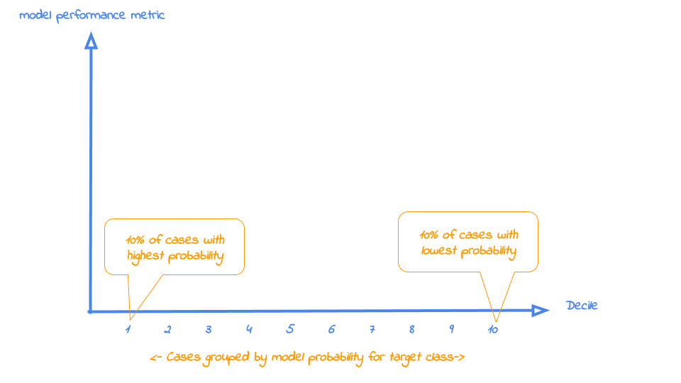
Regarding the ntiles: It’s common practice to split the data to score into 10 equally large groups and call these groups deciles. Observations that belong to the top-10% with highest model probability in a set, are in decile 1 of that set; the next group of 10% with high model probability are decile 2 and finally the 10% observations with the lowest model probability on the target class belong to decile 10.
*Notice that modelplotr does support that you specify the number of equally sized groups with the parameter ntiles. Hence, ntiles=100 results in 100 equally sized groups with in the first group the 1% with the highest model probability and in group 100 the 1% with the lowest model probability. These groups are often referred to as percentiles; modelplotr will also label them as such. Any value between 4 and 100 can be specified for ntiles.
Each of the plots in modelplotr places the ntiles on the x axis and another measure on the y axis. The ntiles are plotted from left to right so the observations with the highest model probability are on the left side of the plot. This results in plots like this:
Now that it’s clear what is on the horizontal axis of each of the plots, we can go into more detail on the metrics for each plot on the vertical axis. For each plot, we’ll start with a brief explanation what insight you gain with the plot from a business perspective. After that, we apply it to our banking data and show some neat features of modelplotr to help you explain the value of your wonderful predictive models to others.
1. Cumulative gains plot
The cumulative gains plot - often named ‘gains plot’ - helps you answer the question:
When we apply the model and select the best X ntiles, what % of the actual target class observations can we expect to target?
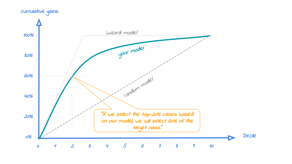
Hence, the cumulative gains plot visualises the percentage of the target class members you have selected if you would decide to select up until ntile X. This is a very important business question, because in most cases, you want to use a predictive model to target a subset of observations - customers, prospects, cases,... - instead of targeting all cases. And since we won't build perfect models all the time, we will miss some potential. And that's perfectly all right, because if we are not willing to accept that, we should not use a model in the first place. Or build only perfect models, that scores all actual target class members with a 100% probability and all the cases that do not belong to the target class with a 0% probability. However, if you’re such a wizard, you don’t need these plots any way or you should have a careful look at your model - maybe you’re cheating?....
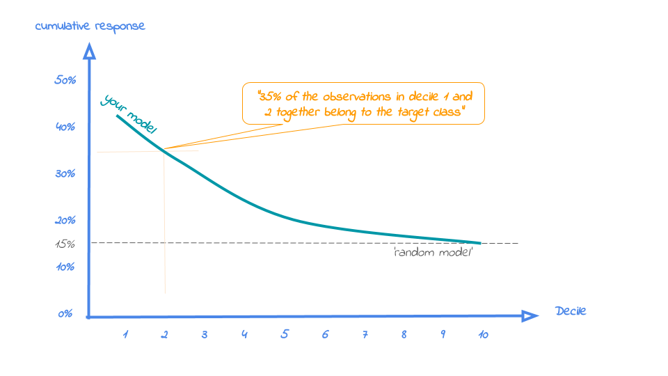
So, we'll have to accept we will lose some. What percentage of the actual target class members you do select with your model at a given ntile, that’s what the cumulative gains plot tells you. The plot comes with two reference lines to tell you how good/bad your model is doing: The random model line and the wizard model line. The random model line tells you what proportion of the actual target class you would expect to select when no model is used at all. This vertical line runs from the origin (with 0% of cases, you can only have 0% of the actual target class members) to the upper right corner (with 100% of the cases, you have 100% of the target class members). It’s the rock bottom of how your model can perform; are you close to this, then your model is not much better than a coin flip. The wizard model is the upper bound of what your model can do. It starts in the origin and rises as steep as possible towards 100%. Say, exactly 10% of all cases belong to the target category. This means that this line goes steep up from the origin to the value of decile 1 (or percentile 10 in case ntiles=100) and cumulative gains of 100% and remains there for all other ntiles as it is a cumulative measure. Your model will always move between these two reference lines - closer to a wizard is always better - and looks like this:
Back to our business example. How many of the term deposit buyers can we select with the top-20% of our predictive models? Let's find out! To generate the cumulate gains plot, we can simply call the function plot_cumgains():
# plot the cumulative gains plot
plot_cumgains(data = plot_input)
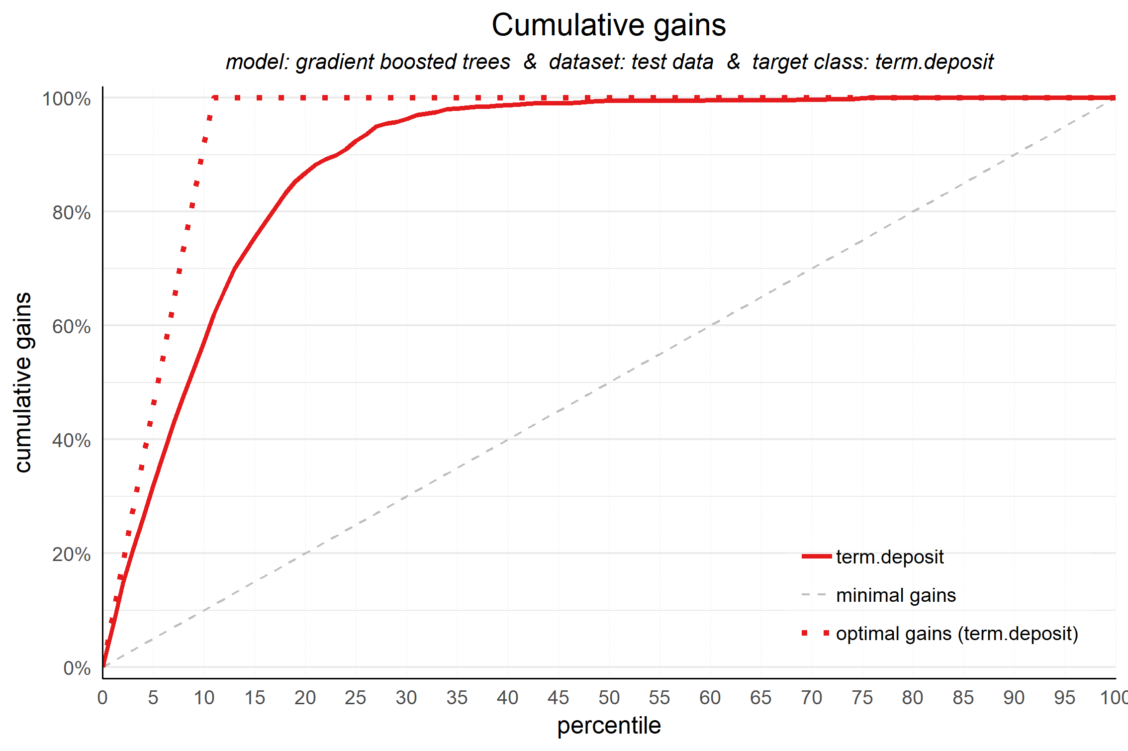
We don't need to specify any other parameters than the data to use, plot_input, which is generated with the plotting_scope() function we ran previously. There are several other parameters available to customize the plot, though. If we want to emphasize the model performance at a specific ntile, we can add both highlighting to the plot and add some explanatory text below the plot. Both are optional, though:
# plot the cumulative gains plot and annotate the plot at percentile = 20
plot_cumgains(data = plot_input,highlight_ntile = 20)
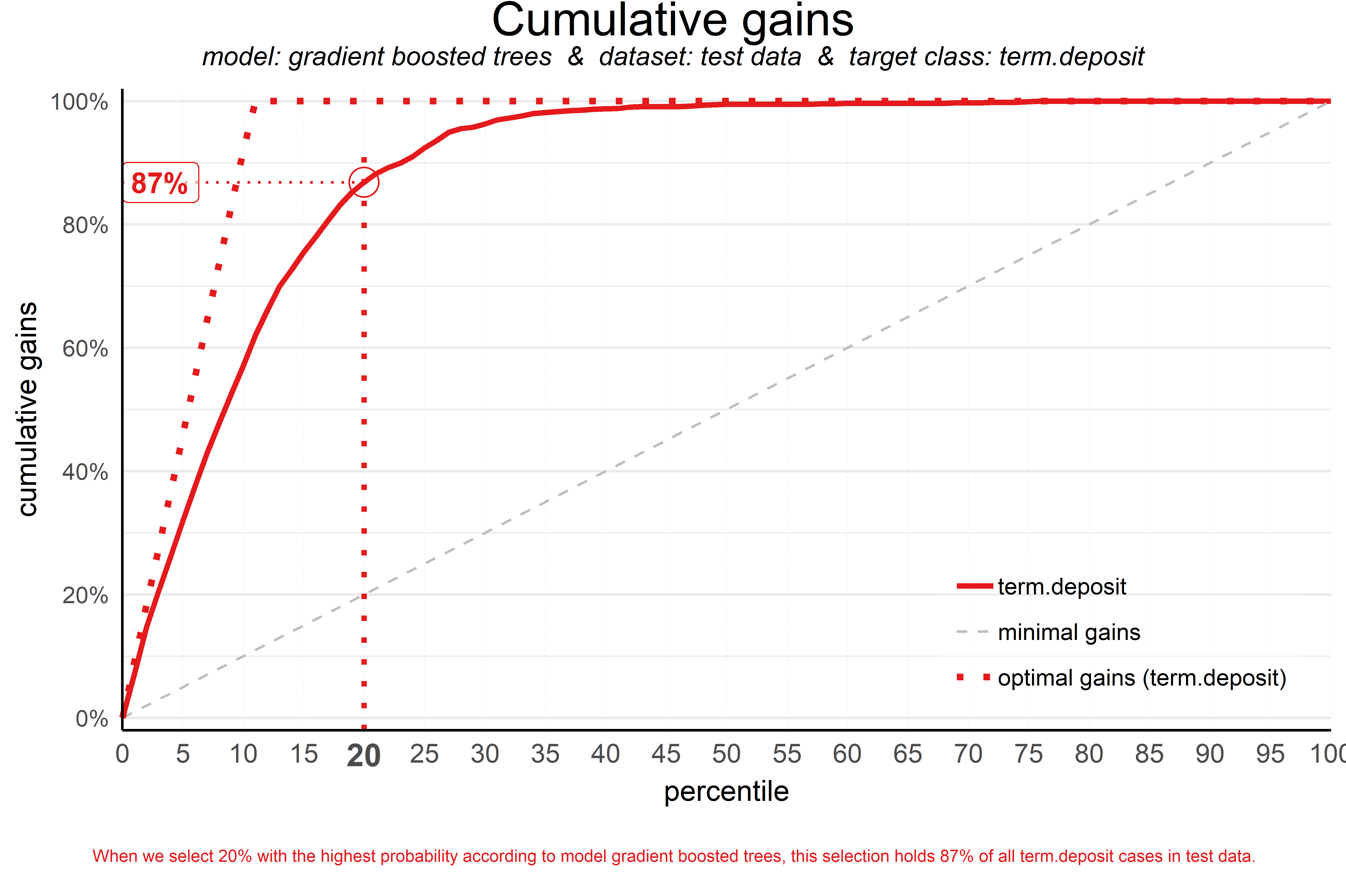
Our highlight_ntile parameter adds some guiding elements to the plot at ntile 20 as well as a text box below the graph with the interpretation of the plot at ntile 20 in words. This interpretation is also printed to the console. Our simple model - only 6 pedictors were used - seems to do a nice job selecting the customers interested in buying term deposites. When we select 20% with the highest probability according to gradient boosted trees, this selection holds 87% of all term deposit cases in test data. With a perfect model, we would have selected 100%, since less than 20% of all customers in the test set buy term deposits. A random pick would only hold 20% of the customers with term deposits. How much better than random do we do? This brings us to plot number two!
2. Cumulative lift plot
The cumulative lift plot, often referred to as lift plot or index plot, helps you answer the question:
When we apply the model and select the best X ntiles, how many times better is that than using no model at all?
The lift plot helps you in explaining how much better selecting based on your model is compared to taking random selections instead. Especially when models are not yet used that often within your organisation or domain, this really helps business understand what selecting based on models can do for them.
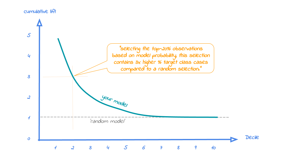
The lift plot only has one reference line: the ‘random model’. With a random model we mean that each observation gets a random number and all cases are devided into ntiles based on these random numbers. When we would do that, the % of actual target category observations in each ntile would be equal to the overall % of actual target category observations in the total set. Since the lift is calculated as the ratio of these two numbers, we get a horizontal line at the value of 1. Your model should however be able to do better, resulting in a high ratio for ntile 1. How high the lift can get, depends on the quality of your model, but also on the % of target class observations in the data: If 50% of your data belongs to the target class of interest, a perfect model would 'only' do twice as good (lift: 2) as a random selection. With a smaller target class value, say 10%, the model can potentially be 10 times better (lift: 10) than a random selection. Therefore, no general guideline of a 'good' lift can be specified. Towards the last ntile, since the plot is cumulative, with 100% of cases, we have the whole set again and therefore the cumulative lift will always end up at a value of 1. It looks like this:
To generate the cumulative lift plot for our gradient boosted trees model predicting term deposit buying, we call the function plot_cumlift(). Let's add some highlighting to see how much better a selection based on our model containing the best 20 (perce)ntiles would be, compared to a random selection of 20% of all customers:
# plot the cumulative lift plot and annotate the plot at percentile = 20
plot_cumlift(data = plot_input,highlight_ntile = 20)
##
## Plot annotation for plot: Cumulative lift
## - When we select 20% with the highest probability according to model gradient boosted trees in test data, this selection for term.deposit cases is 4.3 times better than selecting without a model.
##
##
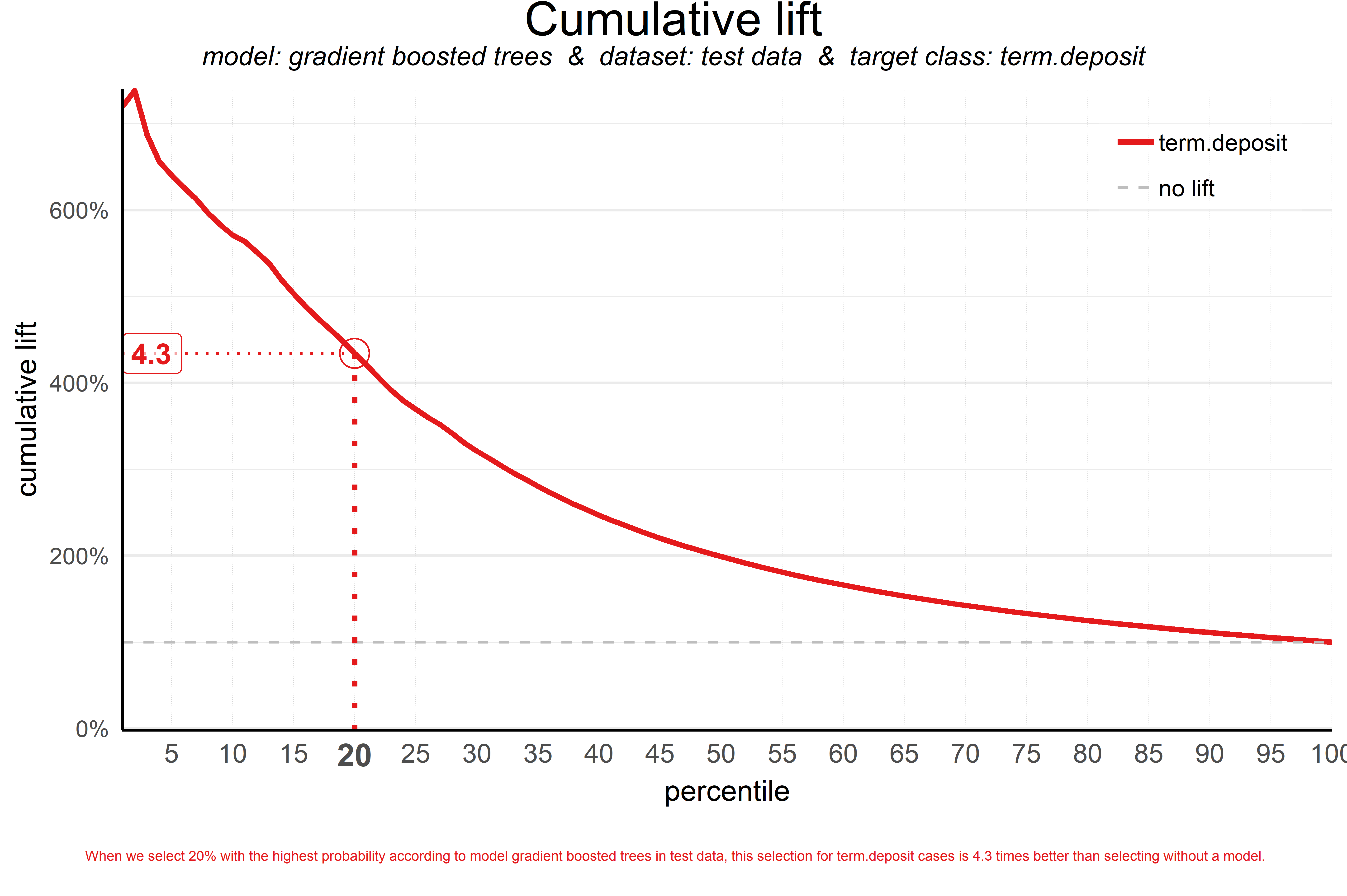
A term deposit campaign targeted at a selection of 20% of all customers based on our gradient boosted trees model can be expected to have a 4 times higher response (434%) compared to a random sample of customers. Not bad, right? The cumulative lift really helps in getting a positive return on marketing investments. It should be noted, though, that since the cumulative lift plot is relative, it doesn't tell us how high the actual reponse will be on our campaign...
3. Response plot
One of the easiest to explain evaluation plots is the response plot. It simply plots the percentage of target class observations per ntile. It can be used to answer the following business question:
When we apply the model and select ntile X, what is the expected % of target class observations in that ntile?
The plot has one reference line: The % of target class cases in the total set. It looks like this:
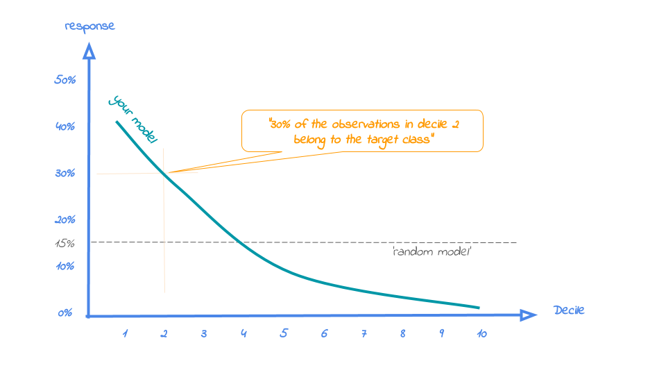
A good model starts with a high response value in the first ntile(s) and suddenly drops quickly towards 0 for later ntiles. This indicates good differentiation between target class members - getting high model scores - and all other cases. An interesting point in the plot is the location where your model’s line intersects the random model line. From that ntile onwards, the % of target class cases is lower than a random selection of cases would hold.
To generate the response plot for our term deposit model, we can simply call the function plot_response(). Let's immediately highlight the plot to have the interpretation of the response plot at (perce)ntile 10 added to the plot:
# plot the response plot and annotate the plot at ntile = 10
plot_response(data = plot_input,highlight_ntile = 10)
##
## Plot annotation for plot: Response
## - When we select ntile 10 according to model gradient boosted trees in dataset test data the % of term.deposit cases in the selection is 50.4%.
##
##
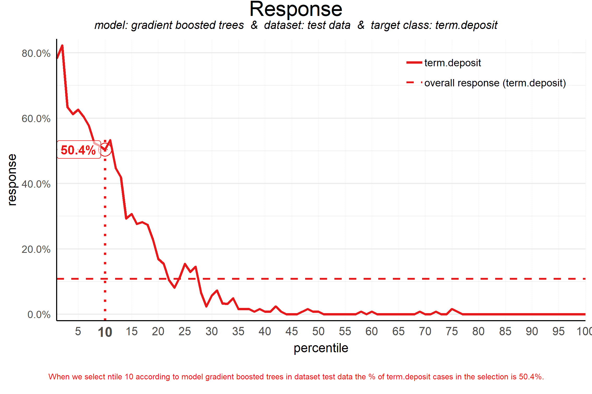
As the plot shows and the text below the plot states: When we select decile 1 according to model gradient boosted trees in dataset test data the % of term deposit cases in the selection is 51%.. This is quite good, especially when compared to the overall likelihood of 12%. The response in the 20th ntile is much lower, about 10%. From ntile 22 onwards, the expected response is lower than the overall likelihood of 12%. However, most of the time, our model will be used to select the highest decile up until some decile. That makes it even more relevant to have a look at the cumulative version of the response plot. And guess what, that's our final plot!
4. Cumulative response plot
Finally, one of the most used plots: The cumulative response plot. It answers the question burning on each business reps lips:
When we apply the model and select up until ntile X, what is the expected % of target class observations in the selection?
The reference line in this plot is the same as in the response plot: the % of target class cases in the total set.
Whereas the response plot crosses the reference line, in the cumulative response plot it never crosses it but ends up at the same point for the last ntile: Selecting all cases up until ntile 100 is the same as selecting all cases, hence the % of target class cases will be exactly the same. This plot is most often used to decide - together with business colleagues - up until what decile to select for a campaign.
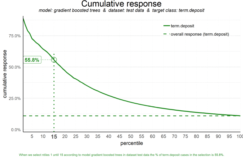
Back to our banking business case. To generate the cumulative response plot, we call the function plot_cumresponse(). Let's highlight it at percentile 30 to see what the overall expected response will be if we select prospects for a term deposit offer based on our gradient boosted trees model:
# plot the cumulative response plot and annotate the plot at decile = 3
plot_cumresponse(data = plot_input,highlight_ntile = 30)
##
## Plot annotation for plot: Cumulative response
## - When we select ntiles 1 until 30 according to model gradient boosted trees in dataset test data the % of term.deposit cases in the selection is 34.9%.
##
##
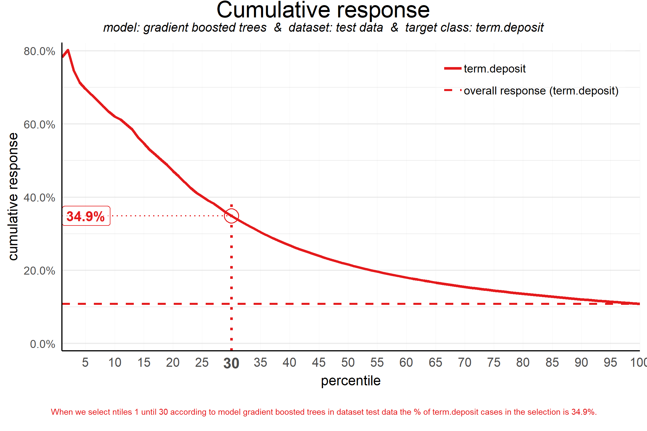
When we select ntiles 1 until 30 according to model gradient boosted trees in dataset test data the % of term deposit cases in the selection is 36%. Since the test data is an independent set, not used to train the model, we can expect the response on the term deposit campaign to be 36%.
The cumulative response percentage at a given decile is a number your business colleagues can really work with: Is that response big enough to have a successfull campaign, given costs and other expectations? Will the absolute number of sold term deposits meet the targets? Or do we lose too much of all potential term deposit buyers by only selecting the top 30%? To answer that question, we can go back to the cumulative gains plot. And that's why there's no absolute winner among these plots and we advice to use them all. To make that happen, there's also a function to easily combine all four plots.
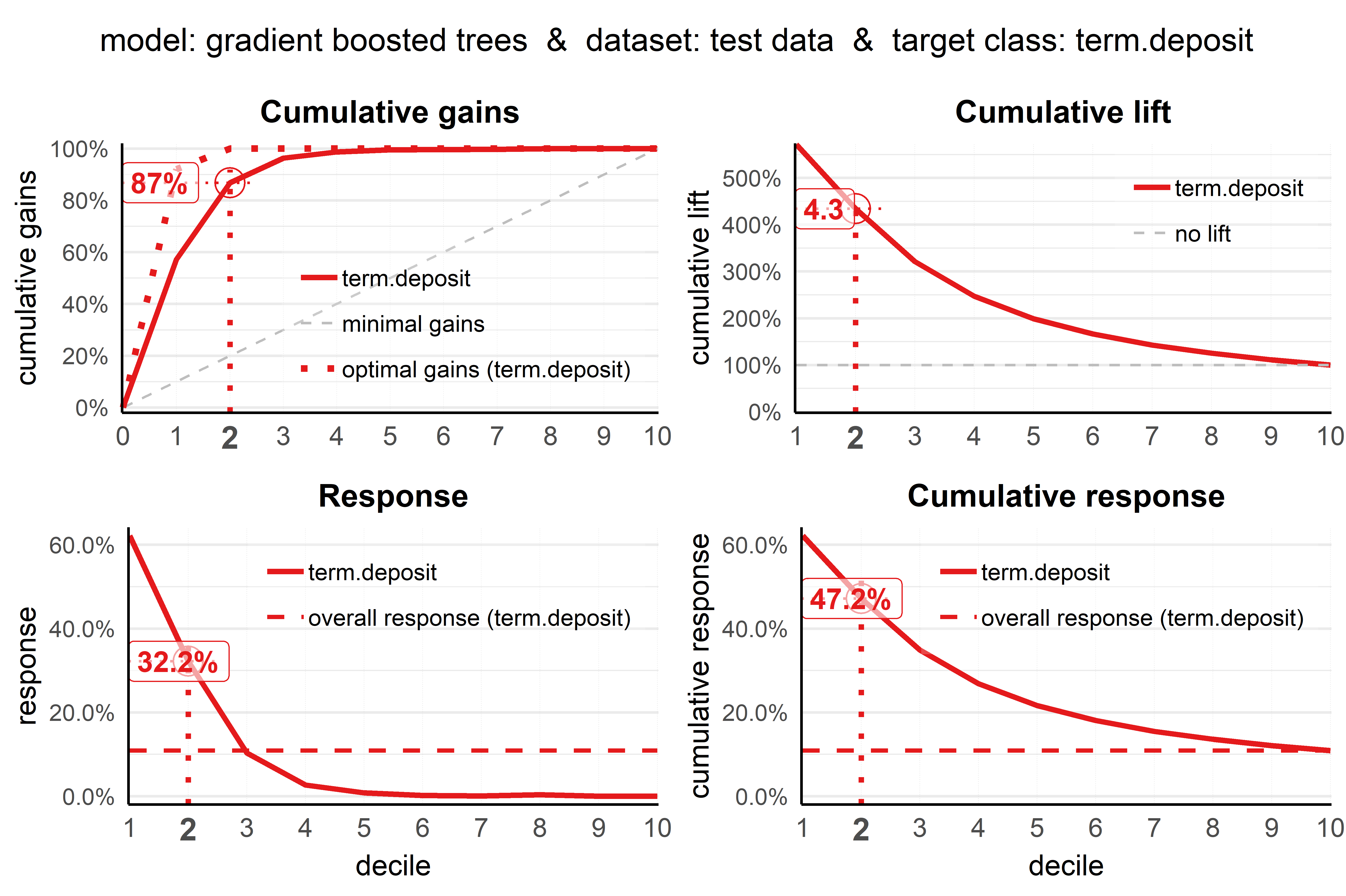
All four plots together
With the function call plot_multiplot we get the previous four plots on one grid. We can easily save it to a file to include it in a presentation or share it with colleagues.
# plot all four evaluation plots and save to file, highlight decile 2
plot_multiplot(data = plot_input,highlight_ntile=2,
               save_fig = TRUE,save_fig_filename = 'Selection model Term Deposits')
##
## Plot annotation for plot: Cumulative gains
## - When we select 20% with the highest probability according to model gradient boosted trees, this selection holds 87% of all term.deposit cases in test data.
##
##
##
## Plot annotation for plot: Cumulative lift
## - When we select 20% with the highest probability according to model gradient boosted trees in test data, this selection for term.deposit cases is 4.3 times better than selecting without a model.
##
##
##
## Plot annotation for plot: Response
## - When we select ntile 2 according to model gradient boosted trees in dataset test data the % of term.deposit cases in the selection is 32.2%.
##
##
##
## Plot annotation for plot: Cumulative response
## - When we select ntiles 1 until 2 according to model gradient boosted trees in dataset test data the % of term.deposit cases in the selection is 47.2%.
##
##
## Warning: No location for saved plot specified! Plot is saved to tempdir(). Specify 'save_fig_filename' to customize location and name.
## Plot is saved as: C:\Users\J9AF3~1.NAG\AppData\Local\Temp\Rtmpc5waFv/Selection model Term Deposits.png
Even more business-savvy: Financial plots
And there's more! To plot the financial implications of implementing a predictive model, modelplotr provides three additional plots: the Costs & revenues plot, the Profit plot and the ROI plot. So, when you know what the fixed costs, variable costs and revenues per sale associated with a campaign based on your model are, you can use these to visualize financial consequences of using your model. Here, we'll just show the Profit plot. See the package vignette for more details on the Costs & Revenues plot and the Return on Investment plot.
The profit plot visualized the cumulative profit up until that decile when the model is used for campaign selection. It can be used to answer the following business question:
When we apply the model and select up until ntile X, what is the expected profit of the campaign?
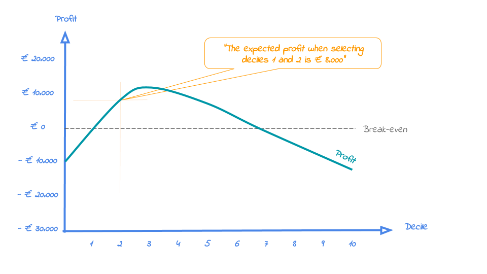
From this plot, it can be quickly spotted with what selection size the campaign profit is maximized. However, this does not mean that this is the best option from an investment point of view.
Business colleagues should be able to tell you the expected costs and revenues regarding the campaign. Let's assume they told us fixed costs for the campaign (a tv commercial and some glossy print material) are in total € 75,000 and each targeted customer costs another € 50 (prospects are called and receive an incentive) and the expected revenue per new term deposit customer is € 250 according to the business case.
#Profit plot - automatically highlighting the ntile where profit is maximized!
plot_profit(data=plot_input,fixed_costs=75000,variable_costs_per_unit=50,profit_per_unit=250)
##
## Plot annotation for plot: Profit
## - When we select ntiles 1 until 19 in dataset test data using model gradient boosted trees to target term.deposit cases the expected profit is <U+20AC>93,850
##
##
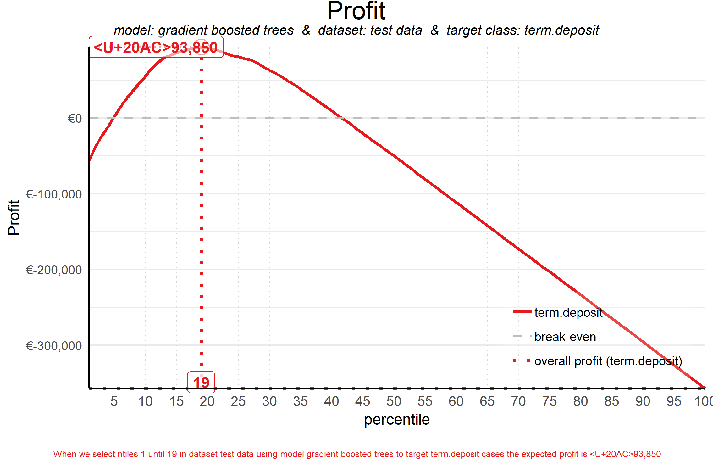
Using this plot, we can decide to select the top 19 ntiles according to our model to maximize profit and earn about € 94,000 with this campaign. Both decreasing and increasing the selection based on the model would harm profits, as the plot clearly shows.
Neat! With these plots, we are able to talk with business colleagues about the actual value of our predictive model, without having to bore them with technicalities any nitty gritty details. We've translated our model in business terms and visualised it to simplify interpretation and communication. Hopefully, this helps many of you in discussing how to optimally take advantage of your predictive model building efforts.
Get more out of modelplotr: using different scopes, highlight ntiles, customize text & colors.
As we mentioned earlier, the modelplotr package also enables to make interesting comparisons, using the scope parameter. Comparisons between different models, between different datasets and (in case of a multiclass target) between different target classes. Also, modelplotr provides a lot of customization options: You can hightlight plots and add annotation texts to explain the plots, change all textual elements in the plots and customize line colors. Curious? Please have a look at the package documentation or read our other posts on modelplotr.
However, to give one example, we could compare whether gradient boosted trees was indeed the best choice to select the top-30% customers for a term deposit offer:
# set plotting scope to model comparison
plot_input <- plotting_scope(prepared_input = scores_and_ntiles,scope = "compare_models")
## Data preparation step 2 succeeded! Dataframe created.
## "prepared_input" aggregated...
## Data preparation step 3 succeeded! Dataframe created.
##
## Models "random forest", "multinomial logit", "gradient boosted trees", "artificial neural network" compared for dataset "test data" and target value "term.deposit".

# plot the cumulative response plot and annotate the plot at ntile 20
plot_cumresponse(data = plot_input,highlight_ntile = 20)
##
## Plot annotation for plot: Cumulative response
## - When we select ntiles 1 until 20 according to model random forest in dataset test data the % of term.deposit cases in the selection is 46.5%.
## - When we select ntiles 1 until 20 according to model multinomial logit in dataset test data the % of term.deposit cases in the selection is 42.1%.
## - When we select ntiles 1 until 20 according to model gradient boosted trees in dataset test data the % of term.deposit cases in the selection is 47.2%.
## - When we select ntiles 1 until 20 according to model artificial neural network in dataset test data the % of term.deposit cases in the selection is 40.7%.
##
##
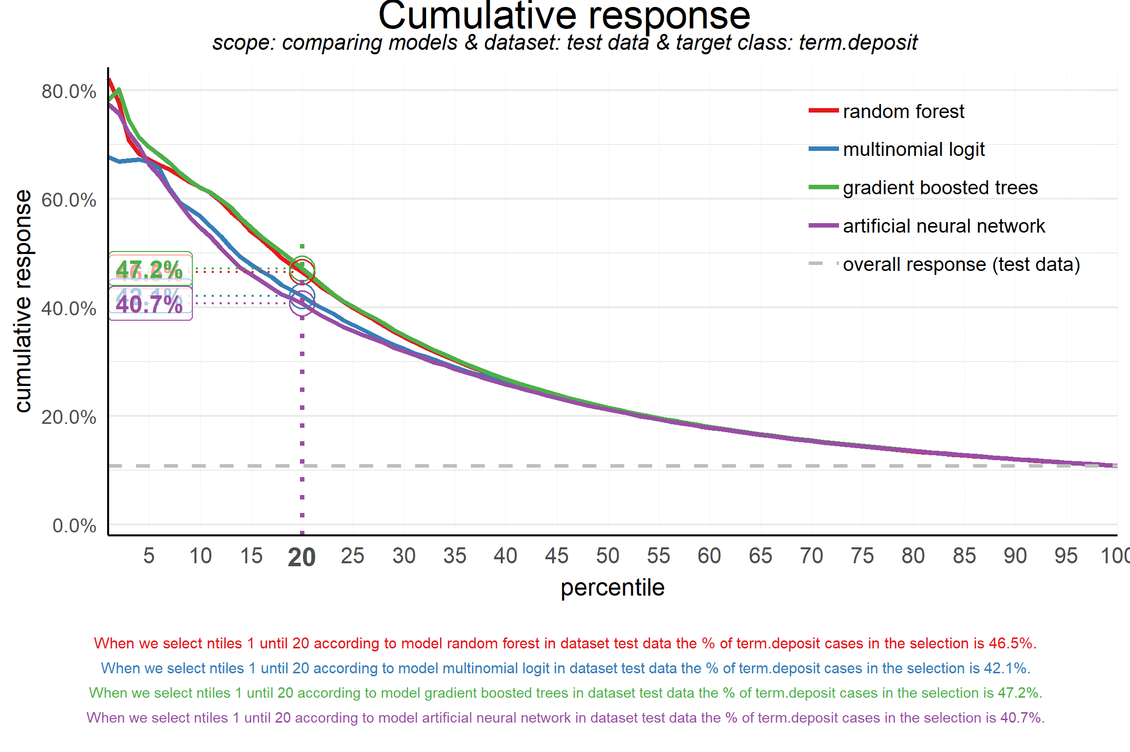
Seems like the algorithm used will not make a big difference in this case. Hopefully you agree by now that using these plots really can make a difference in explaining the business value of your predictive models!
You can read more on how to use modelplotr here. In case you experience issues when using modelplotr, please let us know via the issues section on Github. Any other feedback or suggestions, please let us know via jurriaan.nagelkerke@gmail.com or pb.marcus@hotmail.com. Happy modelplotting!