Why ROC curves are a bad idea to explain your model to business people
The modelplotr package makes it easy to create a number of valuable evaluation plots to assess the business value of a predictive model. Using these plots, it can be shown how implementation of the model will impact business targets like response or return on investment of a campaign.
Why use modelplotr

‘...And as we can see clearly on this ROC plot, the sensitivity of the model at the value of 0.2 on one minus the specificity is quite high! Right?…’.
If your fellow business colleagues didn’t already wander away during your presentation about your fantastic predictive model, it will definitely push them over the edge when you start talking like this. Why? Because the ROC curve is not easy to quickly explain and also difficult to translate into answers on the business questions your spectators have. And these business questions were the reason you’ve built a model in the first place!
What business questions? We build models for all kinds of supervised classification problems. Such as predictive models to select the best records in a dataset, which can be customers, leads, items, events... For instance: You want to know which of your active customers have the highest probability to churn; you need to select those prospects that are most likely to respond to an offer; you have to identify transactions that have a high risk to be fraudulent. During your presentation, your audience is therefore mainly focused on answering questions like: Does your model enable us to select our target audience? How much better will we be doing, using your model? What will the expected response on our campaign be? What is the optimal selection size? Modelplotr helps you answer these busines questions.
During our model building efforts, we should already be focused on verifying how well the model performs. Often, we do so by training the model parameters on a selection or subset of records and test the performance on a holdout set or external validation set. We look at a set of performance measures like the ROC curve and the AUC value. These plots and statistics are very helpful to check during model building and model optimization whether your model is under- or overfitting and what set of parameters performs best on test data. However, these statistics are not that valuable in assessing the business value the model you developed.
One reason that the ROC curve is not that useful in explaining the business value of your model, is because it’s quite hard to explain the interpretation of ‘area under the curve’, ‘specificity’ or ‘sensitivity’ to business people. Another important reason that these statistics and plots are useless in your business meetings is that they don’t help in determining how to apply your predictive model: What percentage of records should we select based on the model? Should we select only the best 10% of cases? Or should we stop at 30%? Or go on until we have selected 70%?... This is something you want to decide together with your business colleague to best match the business plans and campaign targets they have to meet. The four plots - the cumulative gains, cumulative lift, response and cumulative response - we are about to introduce are in our view the best ones for that cause. On top of that, we also introduce three plots that enable plotting the financial impact of using your model in a campaign: The costs & revenues plot, the profit plot and the return on investment plot. In the end, talking about financial consequences of implementing a is often the most effective when discussing the value of your model with business colleagues.
The plots in modelplotr
Before getting into the details how to use modelplotr, let's first introduce the plots you can create with it in more detail. We begin by explaining what in is on the x axis all these plots. Next, we introduce the different measures that are plotted on the y axis of these plots.
All plots: explaining what's on the canvas
Although each plot sheds light on the business value of your model from a different angle, they all use the same data:
- Predicted probability for the target class
- Equally sized groups based on this predicted probability, named ntiles
- Actual number of observed target class observations in these groups (ntiles)
Regarding the ntiles: It’s common practice to split the data to score into 10 equally large groups and call these groups deciles. Observations that belong to the top-10% with highest model probability in a set, are in decile 1 of that set; the next group of 10% with high model probability are decile 2 and finally the 10% observations with the lowest model probability on the target class belong to decile 10.
*Notice that modelplotr does support that you specify the number of equally sized groups with the parameter ntiles. Hence, ntiles=100 results in 100 equally sized groups with in the first group the 1% with the highest model probability and in group 100 the 1% with the lowest model probability. These groups are often referred to as percentiles; modelplotr will also label them as such. Any value between 4 and 100 can be specified for ntiles. For illustration purposes, we will use deciles, hence the default of ntiles=10 *
Each of the plots in modelplotr places the deciles on the x axis and another measure on the y axis. The deciles are plotted from left to right so the observations with the highest model probability are on the left side of the plot. This results in plots like this:

Now that it’s clear what is on the horizontal axis of each of the plots, we can go into more detail on the metrics for each plot on the vertical axis. For each plot, there's a brief explanation what insight you gain with the plot from a business perspective.
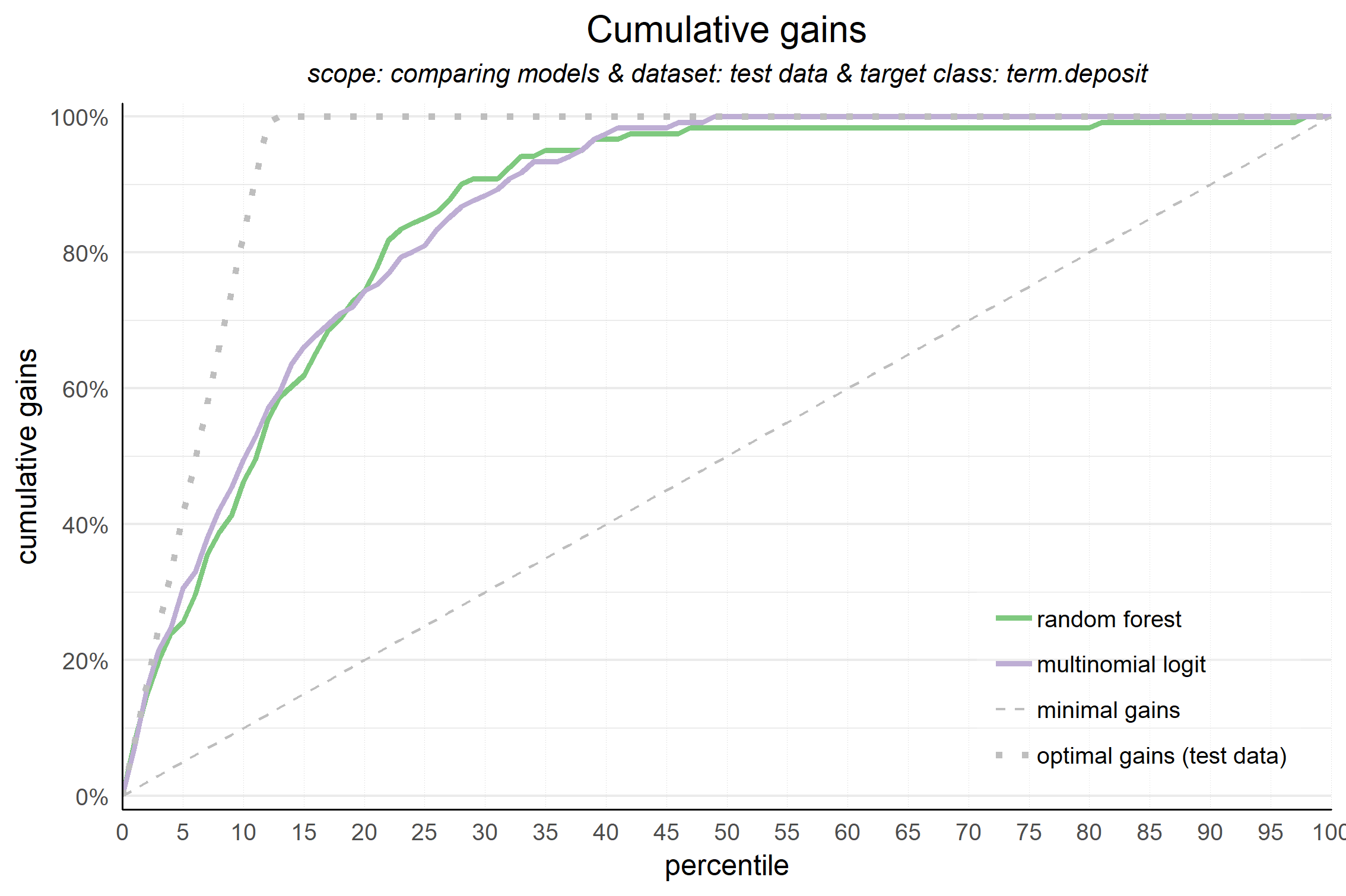
Cumulative gains plot
The cumulative gains plot - often named ‘gains plot’ - helps you answer the question:
When we apply the model and select the best X deciles, what % of the actual target class observations can we expect to target?
Hence, the cumulative gains plot visualises the percentage of the target class members you have selected if you would decide to select up until decile X. This is a very important business question, because in most cases, you want to use a predictive model to target a subset of observations - customers, prospects, cases,... - instead of targeting all cases. And since we won't build perfect models all the time, we will miss some potential.
So, we'll have to accept we will lose some. What percentage of the actual target class members you do select with your model at a given decile, that’s what the cumulative gains plot tells you. The plot comes with two reference lines to tell you how good/bad your model is doing: The random model line and the wizard model line. The random model line tells you what proportion of the actual target class you would expect to select when no model is used at all. This vertical line runs from the origin (with 0% of cases, you can only have 0% of the actual target class members) to the upper right corner (with 100% of the cases, you have 100% of the target class members). It’s the rock bottom of how your model can perform; are you close to this, then your model is not much better than a coin flip. The wizard model is the upper bound of what your model can do. It starts in the origin and rises as steep as possible towards 100%. If less than 10% of all cases belong to the target category, this means that it goes steep up from the origin to the value of decile 1 and cumulative gains of 100% and remains there for all other deciles as it is a cumulative measure. Your model will always move between these two reference lines - closer to a wizard is always better - and looks like this:

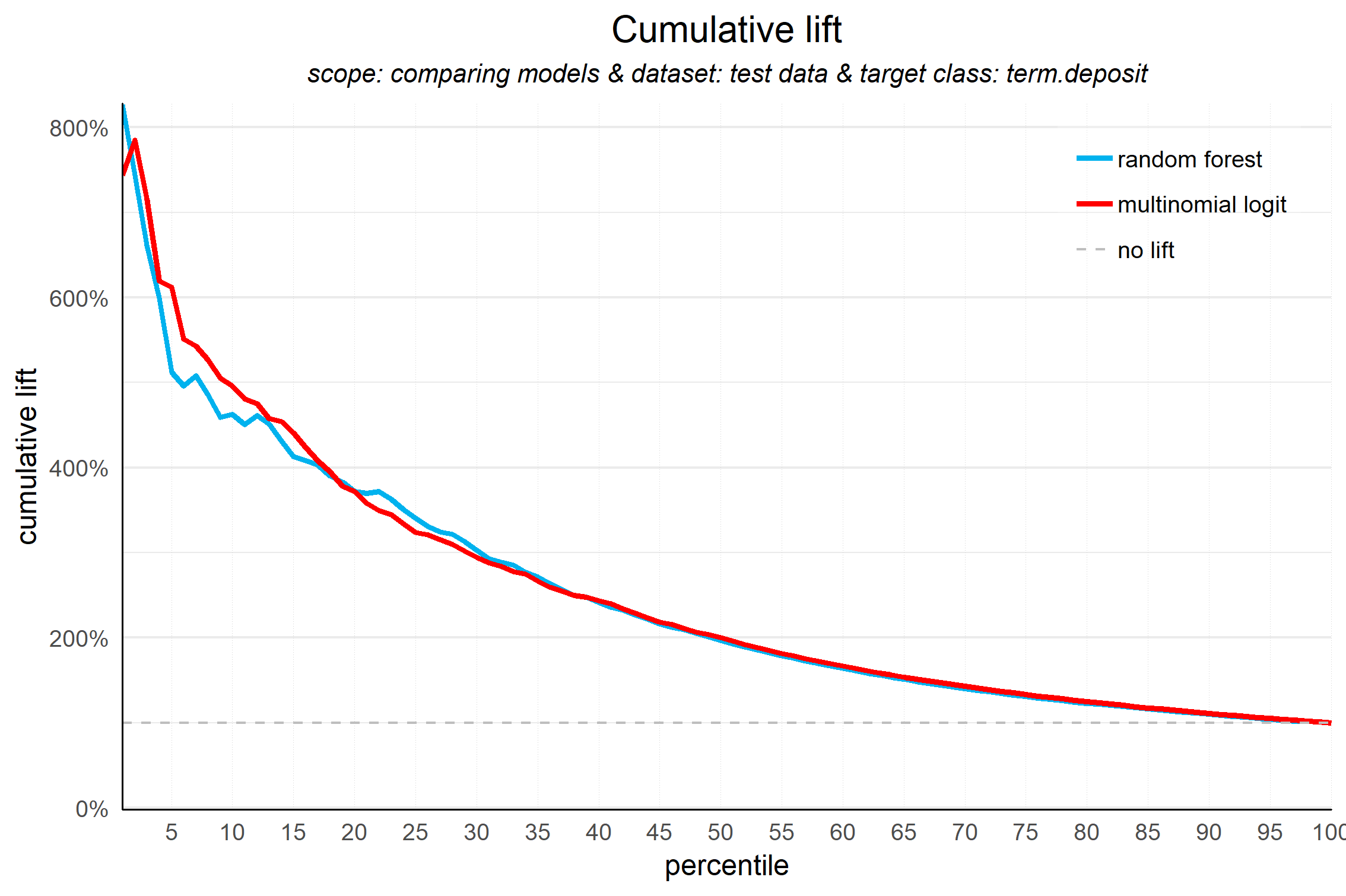
Cumulative lift plot
The cumulative lift plot, often referred to as lift plot or index plot, helps you answer the question:
When we apply the model and select the best X deciles, how many times better is that than using no model at all?
The lift plot helps you in explaining how much better selecting based on your model is compared to taking random selections instead. Especially when models are not yet used within a certain organisation or domain, this really helps business understand what selecting based on models can do for them.
The lift plot only has one reference line: the ‘random model’. With a random model we mean that each observation gets a random number and all cases are devided into deciles based on these random numbers. The % of actual target category observations in each decile would be equal to the overall % of actual target category observations in the total set. Since the lift is calculated as the ratio of these two numbers, we get a horizontal line at the value of 1. Your model should however be able to do better, resulting in a high ratio for decile 1. How high the lift can get, depends on the quality of your model, but also on the % of target class observations in the data: If 50% of your data belongs to the target class of interest, a perfect model would 'only' do twice as good (lift: 2) as a random selection. With a smaller target class value, say 10%, the model can potentially be 10 times better (lift: 10) than a random selection. Therefore, no general guideline of a 'good' lift can be specified. Towards decile 10, since the plot is cumulative, with 100% of cases, we have the whole set again and therefore the cumulative lift will always end up at a value of 1. It looks like this:

Response plot
One of the easiest to explain evaluation plots is the response plot. It simply plots the percentage of target class observations per decile. It can be used to answer the following business question:
When we apply the model and select decile X, what is the expected % of target class observations in that decile?
The plot has one reference line: The % of target class cases in the total set. It looks like this:

A good model starts with a high response value in the first decile(s) and suddenly drops quickly towards 0 for later deciles. This indicates good differentiation between target class members - getting high model scores - and all other cases. An interesting point in the plot is the location where your model’s line intersects the random model line. From that decile onwards, the % of target class cases is lower than a random selection of cases would hold.
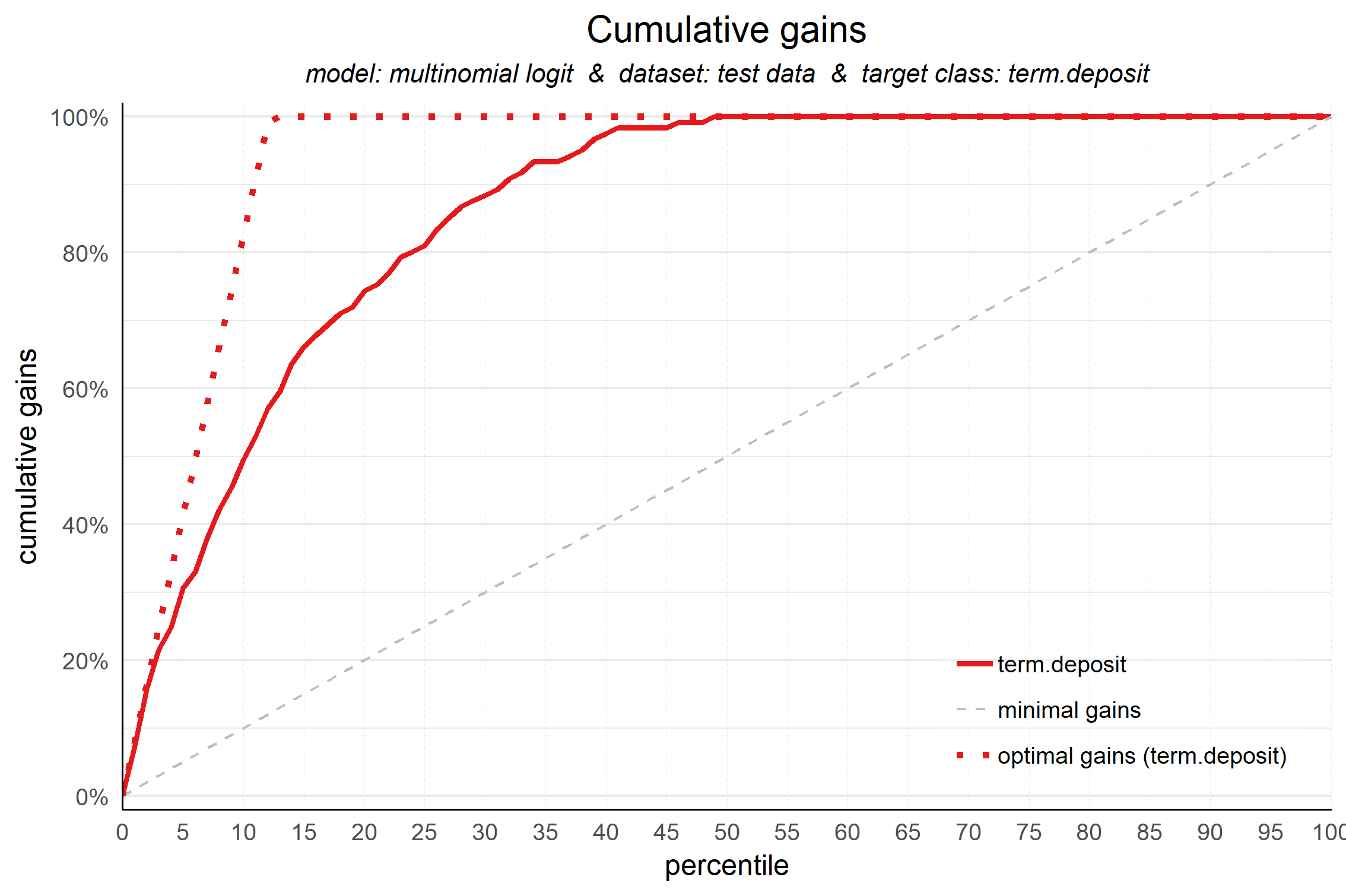
Cumulative response plot
Finally, one of the most used plots: The cumulative response plot. It answers the question burning on each business rep's lips:
When we apply the model and select up until decile X, what is the expected % of target class observations in the selection?
The reference line in this plot is the same as in the response plot: the % of target class cases in the total set.

Whereas the response plot crosses the reference line, in the cumulative response plot it never crosses it but ends up at the same point for decile 10: Selecting all cases up until decile 10 is the same as selecting all cases, hence the % of target class cases will be exactly the same. This plot is most often used to decide - together with business colleagues - up until what decile to select for a campaign.
To plot the financial implications of implementing a predictive model, modelplotr provides three additional plots: the Costs & revenues plot, the Profit plot and the ROI plot.
Costs & Revenues plot
The costs & revenues plot plots both the cumulative revenues and and the cumulative costs (investments) up until that decile when the model is used for campaign selection. It can be used to answer the following business question:
When we apply the model and select up until decile X, what are the expected revenues and investments of the campaign?
The plot includes both costs and revenues lines. The costs are the cumulative costs of selecting up until a given decile and consist of both fixed costs and variable costs. The fixed costs for campaigns often include costs to create the campaign and other costs that do not vary with the size of the campaign selection. The variable costs do depend on the selection size, resulting in a linear increasing line. The revenues take into account the expected response % - as plotted in the cumulative response plot - as well as the expected revenue per response.

The campaign is profitable in the plot area where revenues exceed costs. The optimal profit might be difficult to see quickly, since the reference line is a diagonal. Therefore, to evaluate profitability, the next plot - the profit plot - is more suitable.
Profit plot
The profit plot visualized the cumulative profit up until that decile when the model is used for campaign selection. It can be used to answer the following business question:
When we apply the model and select up until decile X, what is the expected profit of the campaign?

From this plot, it can be quickly spotted with what selection size the campaign profit is maximized. However, this does not mean that this is the best option from an investment point of view. It might be that, taking into consideration the investments that is needed for the profit, another decile is preferred. Therefore, the roi plot is needed as well.
Return on investment plot
The Return on Investment plot plots the cumulative revenues as a percentage of investments up until that decile when the model is used for campaign selection. It can be used to answer the following business question:
When we apply the model and select up until decile X, what is the expected % return on investment of the campaign?

From this plot, the selection size with the optimal return on investment for the campaign is easily identified. Do note that the decile at which the campaign profit is maximized, is not necessarily the same as the decile where the campaign ROI is maximized. It can be the case that a bigger selection (higher decile) results in a higher profit, however this selection needs a larger investment, impacting the ROI negatively.
Data preparation steps
To be able to use the plots presented above, you need to create a dataframe that serves as an input for all these plots. We've included three functions in modelplotr to create this input dataframe really easy and fast. Especially when you've trained your models using caret, mlr, h2o or keras the process is super simple. In this case, you ony need two function calls to prepare your data for plotting. In case you use another package to train your models or when you've trained your models outside of R, you can still use modelplotr, you just need one extra step. Further on we'll guide you how to prepare the input in that case.
Some example data
To show how modelplotr works, we've included some test data in the package. This dataset is a subset of the dataset made available by the University of California, Irvine. The complete dataset is available here: https://archive.ics.uci.edu/ml/machine-learning-databases/00222/bank-additional.zip. Let's load the data:
# load example data (Bank clients that have/have not subscribed a term deposit - see ?bank_td for details)
data("bank_td")

str(bank_td)
## 'data.frame':    2000 obs. of  7 variables:
##  $ has_td   : Factor w/ 2 levels "term.deposit",..: 2 2 2 2 2 2 2 2 2 2 ...
##  $ td_type  : Factor w/ 4 levels "no.td","td.type.A",..: 1 1 1 1 1 1 1 1 1 1 ...
##  $ duration : int  312 82 133 150 393 174 197 104 420 364 ...
##  $ campaign : int  1 4 1 4 2 1 1 1 1 2 ...
##  $ pdays    : int  999 999 999 999 999 999 999 6 1 999 ...
##  $ previous : int  0 0 0 0 0 1 0 1 1 0 ...
##  $ euribor3m: num  4.86 4.96 4.96 4.96 4.96 ...
A brief introduction to the data: This dataset contains 7 variables, including 2 potential target variables and 5 features to predict these targets. The binary target is has_td; it indicates whether the client has subscribed for a term deposit ('term.deposit') or not ('no.term.deposit'). The multinomial target is td_type which has four possible values: 'no.td', 'td.type.A', 'td.type.B' and 'td.type.C'. This target is included to show that modelplotr also works to plot predictive models with multiclass targets. The five features are a subset of all features available in the actual source, just to have some predictors available to build some example models evaluate with modelplotr. For details on the data, see ?bank_td.
Now, let's train some models. To illustrate that you can use models trained using caret, mlr, h2o and keras, we'll train some models first, one for each package, and include these models in our input for the plots. This way, we can easily compare the models in the plots. Also, we use a train set and a test set for each model, enabling us to also compare between datasets. More on modelplotr's options to compare stuff (models, datasets, target classes) in the next section on Plotting scopes.
# prepare data for training model for binomial target has_td and train models
train_index =  base::sample(seq(1, nrow(bank_td)),size = 0.5*nrow(bank_td) ,replace = FALSE)
train = bank_td[train_index,c('has_td','duration','campaign','pdays','previous','euribor3m')]
test = bank_td[-train_index,c('has_td','duration','campaign','pdays','previous','euribor3m')]

#train models using mlr...
trainTask <- mlr::makeClassifTask(data = train, target = "has_td")
testTask <- mlr::makeClassifTask(data = test, target = "has_td")
mlr::configureMlr() # this line is needed when using mlr without loading it (mlr::)
task = mlr::makeClassifTask(data = train, target = "has_td")
lrn = mlr::makeLearner("classif.randomForest", predict.type = "prob")
rf = mlr::train(lrn, task)

#... or train models using caret...
# setting caret cross validation, here tuned for speed (not accuracy!)
fitControl <- caret::trainControl(method = "cv",number = 2,classProbs=TRUE)
# mnl model using glmnet package
mnl = caret::train(has_td ~.,data = train, method = "glmnet",trControl = fitControl)
## Warning in load(system.file("models", "models.RData", package = "caret")):
## strings not representable in native encoding will be translated to UTF-8
## Loading required package: lattice
## Loading required package: ggplot2
Modelplotr can be used with models built with h2o and keras just as easily. Want to see this in action? Run the code below and add these models to the function prepare_scores_and_ntiles() in the next step.
#.. or train models using h2o... [NOT RUN]
h2o::h2o.init()
h2o::h2o.no_progress()
h2o_train = h2o::as.h2o(train)
h2o_test = h2o::as.h2o(test)
gbm <- h2o::h2o.gbm(y = "has_td",
                          x = setdiff(colnames(train), "has_td"),
                          training_frame = h2o_train,
                          nfolds = 5)

#.. or train models using keras...  [NOT RUN]
x_train <- as.matrix(train[,-1]); y=train[,1]; y_train <- keras::to_categorical(as.numeric(y)-1); `%>%` <- magrittr::`%>%`
nn <- keras::keras_model_sequential() %>%
keras::layer_dense(units = 16,kernel_initializer = "uniform", activation='relu',input_shape = NCOL(x_train)) %>%
  keras::layer_dense(units = 16,kernel_initializer = "uniform", activation='relu') %>%
  keras::layer_dense(units = length(levels(train[,1])),activation='softmax')
nn %>% keras::compile(optimizer = 'rmsprop',loss = 'categorical_crossentropy',metrics = c('accuracy'))
nn %>% keras::fit(x_train,y_train,epochs = 20,batch_size = 1028,verbose=0)
Now that we have some datasets and some trained models, we can start using modelplotr to prepare the data for plotting:
prepare_scores_and_ntiles()
This function builds a dataframe object that contains actuals and predictions on the target variable for each dataset in datasets and each model in models. It contains the dataset name, actuals on the target, the predicted probabilities for each class of the target and attribution to ntiles in the dataset for each class of the target.
The function prepare_scores_and_ntiles() has 6 parameters, of which 3 are required:
| Parameter | Type.and.Description |
|---|---|
| datasets * | List of Strings. A list of the names of the dataframe objects to include in model evaluation. All dataframes need to contain target variable and feature variables. |
| dataset_labels | List of Strings. A list of labels for the datasets, user. When dataset_labels is not specified, the names from datasets are used. |
| models * | List of Strings. Names of the model objects containing parameters to apply models to data. To use this function, model objects need to be generated by the mlr package or by the caret package or by the h20 package. Modelplotr automatically detects whether the model is built using mlr or caret or h2o. |
| model_labels | List of Strings. Labels for the models to use in plots. When model_labels is not specified, the names from moddels are used. |
| target_column * | String. Name of the target variable in datasets. Target can be either binary or multinomial. Continuous targets are not supported. |
| ntiles | Integer. Number of ntiles. The ntile parameter represents the specified number of equally sized buckets the observations in each dataset are grouped into. By default, observations are grouped in 10 equally sized buckets, often referred to as deciles. |
Now, let's use the scores_and_ntiles() function on our models to evaluate the business performance on both the train and the test data:
# prepare data (for h2o/keras: add "gbm" and "nn" to models and nice labels to model_labels params)

scores_and_ntiles <- prepare_scores_and_ntiles(datasets=list("train","test"),
                      dataset_labels = list("train data","test data"),
                      models = list("rf","mnl"),
                      model_labels = list("random forest","multinomial logit"),
                      target_column="has_td",
                      ntiles = 100)
## ... scoring mlr model "rf" on dataset "train".
## ... scoring caret model "mnl" on dataset "train".
## ... scoring mlr model "rf" on dataset "test".
## ... scoring caret model "mnl" on dataset "test".
## Data preparation step 1 succeeded! Dataframe created.
This is what the resulting dataframe looks like (first 5 rows):
| model_label | dataset_label | y_true | prob_term.deposit | prob_no.term.deposit | ntl_term.deposit | ntl_no.term.deposit |
|---|---|---|---|---|---|---|
| random forest | train data | no.term.deposit | 0.000 | 1.000 | 59 | 7 |
| random forest | train data | no.term.deposit | 0.000 | 1.000 | 79 | 6 |
| random forest | train data | no.term.deposit | 0.062 | 0.938 | 23 | 78 |
| random forest | train data | no.term.deposit | 0.000 | 1.000 | 97 | 25 |
| random forest | train data | no.term.deposit | 0.000 | 1.000 | 84 | 38 |
plotting_scope()
This function builds a dataframe in the required format for all modelplotr plots, relevant to the selected scope of evaluation. Each record in this dataframe represents a unique combination of datasets, models, target classes and ntiles.
As an input, plotting_scope can handle a dataframe created with prepare_scores_and_ntiles (see above) or created otherwise with similar layout. Also, you can provide a dataframe created with aggregate_over_ntiles(). See the section below for more info on the function aggregate_over_ntiles.
Aside from the input, the most important parameter is scope=. There are four perspectives you can take to plot with modelplotr:
| Scope | Description |
|---|---|
| "no_comparison" (default) | In this perspective, you're interested in the performance of one model on one dataset for one target class. Therefore, only one line is plotted in the plots. The parameters select_model_label, select_dataset_label and select_targetclass determine which group is plotted. When not specified, the first alphabetic model, the first alphabetic dataset and the smallest (when select_smallest_targetclass=TRUE) or first alphabetic target value are selected |
| "compare_models" | In this perspective, you're interested in how well different models perform in comparison to each other on the same dataset and for the same target value. This results in a comparison between models available in ntiles_aggregate\$model_label for a selected dataset (default: first alphabetic dataset) and for a selected target value (default: smallest (when select_smallest_targetclass=TRUE) or first alphabetic target value). |
| "compare_datasets" | In this perspective, you're interested in how well a model performs in different datasets for a specific model on the same target value. This results in a comparison between datasets available in ntiles_aggregate\$dataset_label for a selected model (default: first alphabetic model) and for a selected target value (default: smallest (when select_smallest_targetclass=TRUE) or first alphabetic target value). |
| "compare_targetclasses" | In this perspective, you're interested in how well a model performs for different target values on a specific dataset.This resuls in a comparison between target classes available in ntiles_aggregate\$target_class for a selected model (default: first alphabetic model) and for a selected dataset (default: first alphabetic dataset). |
Other parameters let you select a subset of models/datasets/target classes you want to include in your plot, see ?plotting_scope for details.
| Parameter | Type.and.Description |
|---|---|
| prepared_input * | Dataframe. Dataframe created with prepare_scores_and_ntiles or dataframe created with aggregate_over_ntiles or a dataframe that is created otherwise with similar layout as the output of these functions (see ?prepare_scores_and_ntiles and ?aggregate_over_ntiles for layout details) |
| scope | String. Evaluation type of interest. Possible values: "compare_models","compare_datasets", "compare_targetclasses","no_comparison". Default is NA, equivalent to "no_comparison". |
| select_model_label | String. Selected model when scope is "compare_datasets" or "compare_targetclasses" or "no_comparison". Needs to be identical to model descriptions as specified in model_labels (or models when model_labels is not specified). When scope is "compare_models", select_model_label can be used to take a subset of available models. |
| select_dataset_label | String. Selected dataset when scope is compare_models or compare_targetclasses or no_comparison. Needs to be identical to dataset descriptions as specified in dataset_labels (or datasets when dataset_labels is not specified). When scope is "compare_datasets", select_dataset_label can be used to take a subset of available datasets. |
| select_targetclass | String. Selected target value when scope is compare_models or compare_datasets or no_comparison. Default is smallest value when select_smallest_targetclass=TRUE, otherwise first alphabetical value. When scope is "compare_targetclasses", select_targetclass can be used to take a subset of available target classes. |
| select_smallest_targetclass | Boolean. Select the target value with the smallest number of cases in dataset as group of interest. Default is True, hence the target value with the least observations is selected |
Now, let's use plotting_scope to generate the input for all plots:
#generate input data frame for all plots in modelplotr
plot_input <- plotting_scope(prepared_input = scores_and_ntiles)
## Data preparation step 2 succeeded! Dataframe created.
## "prepared_input" aggregated...
## Data preparation step 3 succeeded! Dataframe created.
##
## No comparison specified, default values are used.
##
## Single evaluation line will be plotted: Target value "term.deposit" plotted for dataset "test data" and model "multinomial logit.
## "
## -> To compare models, specify: scope = "compare_models"
## -> To compare datasets, specify: scope = "compare_datasets"
## -> To compare target classes, specify: scope = "compare_targetclasses"
## -> To plot one line, do not specify scope or specify scope = "no_comparison".
Since we only provided the input data and not the scope, the default scope (no comparison) is used. To adjust, specify scope= and/or set the other parameters to customize the models/datasets/target classes you want to include in your plots.
Custom prepration of modelplotr input
Maybe you prefer to prepare the input for modelplotr differently. For instance when your models are not created with mlr, catet, h2o or keras. Or when your models are created outside of R or your already have the scored data available. In these cases, you have two extra options to prepare the input for plotting_scope, as visualised below:

Option 2: Prepare input for aggregate_over_ntiles()
With option 2, you prepare your own dataframe containing actuals and probabilities and ntiles (1st ntile = (1/#ntiles) percent with highest model probability, last ntile = (1/#ntiles) percent with lowest probability according to model) , In that case, make sure the input dataframe contains the folowing columns & formats:
| column | type | definition |
|---|---|---|
| model_label | Factor | Name of the model object |
| dataset_label | Factor | Datasets to include in the plot as factor levels |
| y_true | Factor | Target with actual values |
| prob_[tv1] | Decimal | Probability according to model for target value 1 |
| prob_[tv2] | Decimal | Probability according to model for target value 2 |
| ... | ... | ... |
| prob_[tvn] | Decimal | Probability according to model for target value n |
| ntl_[tv1] | Integer | Ntile based on probability according to model for target value 1 |
| ntl_[tv2] | Integerl | Ntile based on probability according to model for target value 2 |
| ... | ... | ... |
| ntl_[tvn] | Integer | Ntile based on probability according to model for target value n |
Once you have this data frame prepared, you can use it as an input for plotting_scope(), as it aggregates the input automatically. If you prefer, you can aggregate it first yourself using aggregate_over_ntiles().
Option 3: Prepare input for plotting_scope()
A third option is to build an aggregated data frame yourself as an input for plotting_scope(). This does require some extra preparation that is not needed when using option 2, but this can be the better option when you don't want to move around actual and predicted scores on individual cases, due to size or maybe privacy/confidentiality. In this case, make sure the data frame you create, exactly matches the definitions below:
| column | type | definition |
|---|---|---|
| model_label | String | Name of the model object |
| dataset_label | Factor | Datasets to include in the plot as factor levels |
| target_class | String or Integer | Target classes to include in the plot |
| ntile | Integer | Ntile groups based on model probability for target class |
| neg | Integer | Number of cases not belonging to target class in dataset in ntile |
| pos | Integer | Number of cases belonging to target class in dataset in ntile |
| tot | Integer | Total number of cases in dataset in ntile |
| pct | Decimal | Percentage of cases in dataset in ntile that belongs to target class (pos/tot) |
| negtot | Integer | Total number of cases not belonging to target class in dataset |
| postot | Integer | Total number of cases belonging to target class in dataset |
| tottot | Integer | Total number of cases in dataset |
| pcttot | Decimal | Percentage of cases in dataset that belongs to target class (postot / tottot) |
| cumneg | Integer | Cumulative number of cases not belonging to target class in dataset from ntile 1 up until ntile |
| cumpos | Integer | Cumulative number of cases belonging to target class in dataset from ntile 1 up until ntile |
| cumtot | Integer | Cumulative number of cases in dataset from ntile 1 up until ntile |
| cumpct | Integer | Cumulative percentage of cases belonging to target class in dataset from ntile 1 up until ntile (cumpos/cumtot) |
| gain | Decimal | Gains value for dataset for ntile (pos/postot) |
| cumgain | Decimal | Cumulative gains value for dataset for ntile (cumpos/postot) |
| gain_ref | Decimal | Lower reference for gains value for dataset for ntile (ntile/#ntiles) |
| gain_opt | Decimal | Upper reference for gains value for dataset for ntile |
| lift | Decimal | Lift value for dataset for ntile (pct/pcttot) |
| cumlift | Decimal | Cumulative lift value for dataset for ntile ((cumpos/cumtot)/pcttot) |
| cumlift_ref | Decimal | Reference value for Cumulative lift value (constant: 1) |
Once you have this data frame prepared, you can use it as an input for plotting_scope().
Plotting
Now that we have data that are well prepared for all plots, plotting is quite easy. For instance, the cumulative gains plot:
plot_cumgains(data = plot_input)
Creating the other non-financial plots is just as easy:
#Cumulative lift
plot_cumlift(data = plot_input)

#Response plot
plot_response(data = plot_input)

#Cumulative response plot
plot_cumresponse(data = plot_input)
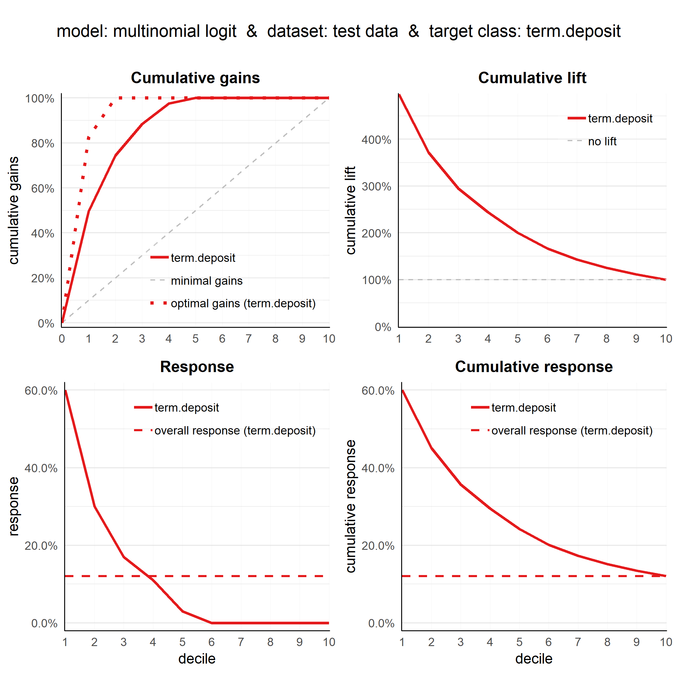
The cumulative lift plot, cumulative gains plot, response plot and cumulative response plot can be combined on one canvas:
## ... scoring mlr model "rf" on dataset "train".
## ... scoring caret model "mnl" on dataset "train".
## ... scoring mlr model "rf" on dataset "test".
## ... scoring caret model "mnl" on dataset "test".
## Data preparation step 1 succeeded! Dataframe created.
## Data preparation step 2 succeeded! Dataframe created.
## "prepared_input" aggregated...
## Data preparation step 3 succeeded! Dataframe created.
##
## No comparison specified, default values are used.
##
## Single evaluation line will be plotted: Target value "term.deposit" plotted for dataset "test data" and model "multinomial logit.
## "
## -> To compare models, specify: scope = "compare_models"
## -> To compare datasets, specify: scope = "compare_datasets"
## -> To compare target classes, specify: scope = "compare_targetclasses"
## -> To plot one line, do not specify scope or specify scope = "no_comparison".
plot_multiplot(data = plot_input)
## Data preparation step 2 succeeded! Dataframe created.
## "prepared_input" aggregated...
## Data preparation step 3 succeeded! Dataframe created.
##
## No comparison specified, default values are used.
##
## Single evaluation line will be plotted: Target value "term.deposit" plotted for dataset "test data" and model "multinomial logit.
## "
## -> To compare models, specify: scope = "compare_models"
## -> To compare datasets, specify: scope = "compare_datasets"
## -> To compare target classes, specify: scope = "compare_targetclasses"
## -> To plot one line, do not specify scope or specify scope = "no_comparison".
There is a lot you can customize for the plots in modelplotr: all textual elements, line colors, highlighting and annotating the plots at a specific ntile. All these options are discussed further on.
For financial plots, three extra parameters need to be provided:
| Parameter | Type.and.Description |
|---|---|
| fixed_costs | Numeric. Specifying the fixed costs related to a selection based on the model. These costs are constant and do not vary with selection size (ntiles). |
| variable_costs_per_unit | Numeric. Specifying the variable costs per selected unit for a selection based on the model. These costs vary with selection size (ntiles). |
| profit_per_unit | Numeric. Specifying the profit per unit in case the selected unit converts / responds positively. |
With these extra parameters, all three financial plots can be plotted, for instance the ROI plot:
plot_roi(data = plot_input,fixed_costs = 1000,variable_costs_per_unit = 10,profit_per_unit = 50)
##
## Plot annotation for plot: Return on Investment (ROI)
## - When we select ntiles 1 until 14 in dataset test data using model multinomial logit to target term.deposit cases the expected return on investment is 60%.
##
##
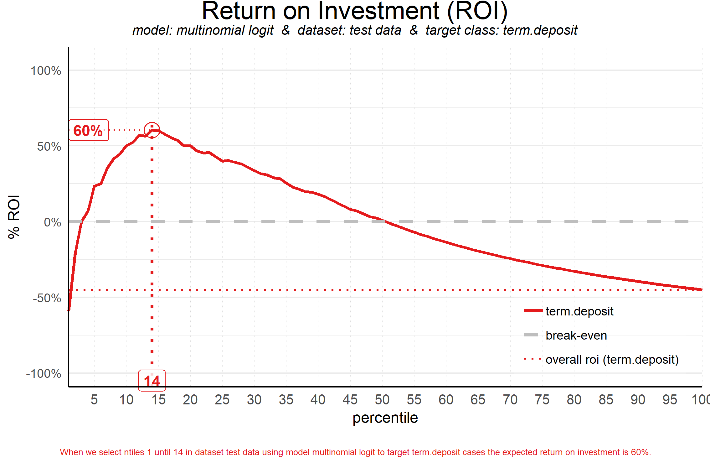
By default, in the ROI plot the ntile is highlighted where return on investment is highest. In the profit plot and costs & revenues plot, the ntile where the profit is highest is highlighted by default. This can be changed, see the section on highlighting or ?plot_roi / ?plot_profit / ?plot_costsrevs for details. As an example:
#Costs & Revenues plot, highlighted at max roi instead of max profit
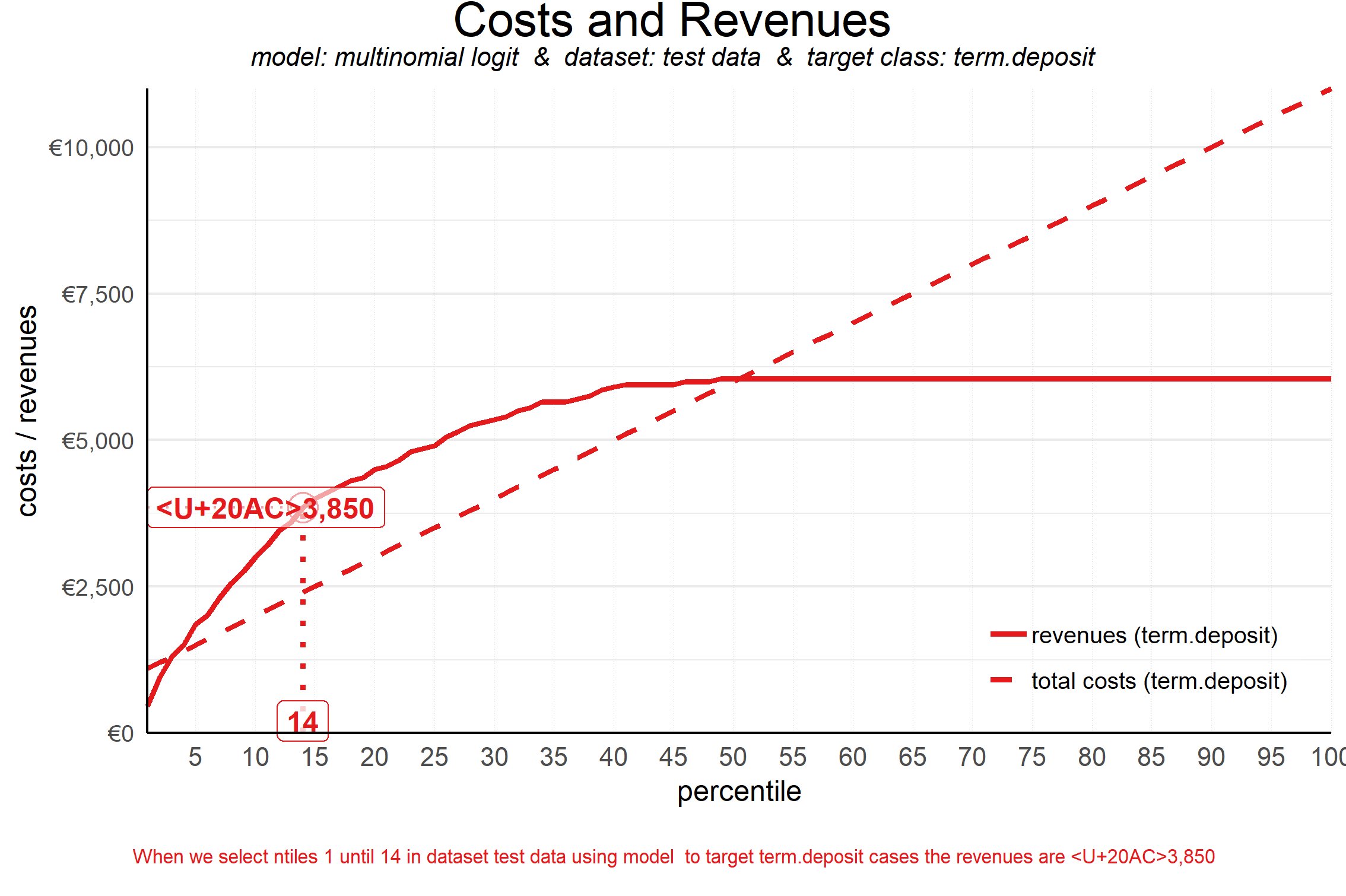
plot_costsrevs(data = plot_input,fixed_costs = 1000,variable_costs_per_unit = 10,profit_per_unit = 50,highlight_ntile = "max_roi")
##
## Plot annotation for plot: Costs and Revenues
## - When we select ntiles 1 until 14 in dataset test data using model to target term.deposit cases the revenues are <U+20AC>3,850
##
##
#Profit plot , highlighted at custom ntile instead of at max profit
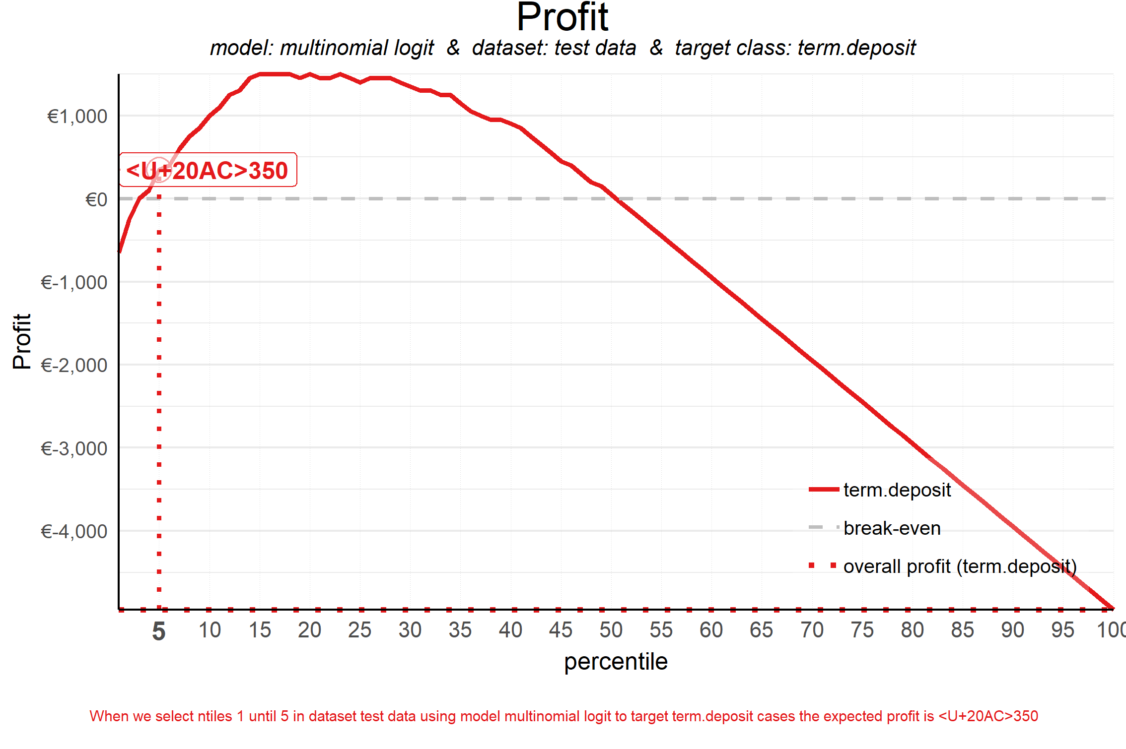
plot_profit(data = plot_input,fixed_costs = 1000,variable_costs_per_unit = 10,profit_per_unit = 50,highlight_ntile = 5)
##
## Plot annotation for plot: Profit
## - When we select ntiles 1 until 5 in dataset test data using model multinomial logit to target term.deposit cases the expected profit is <U+20AC>350
##
##
Highlighting and customizing plots
The look and feel of plots can be customized in a number of ways. In the next sections all customizations are presented.
highlighting
To highlight a specific decile (or ntile), this can be done with the parameter highlight_ntile=.
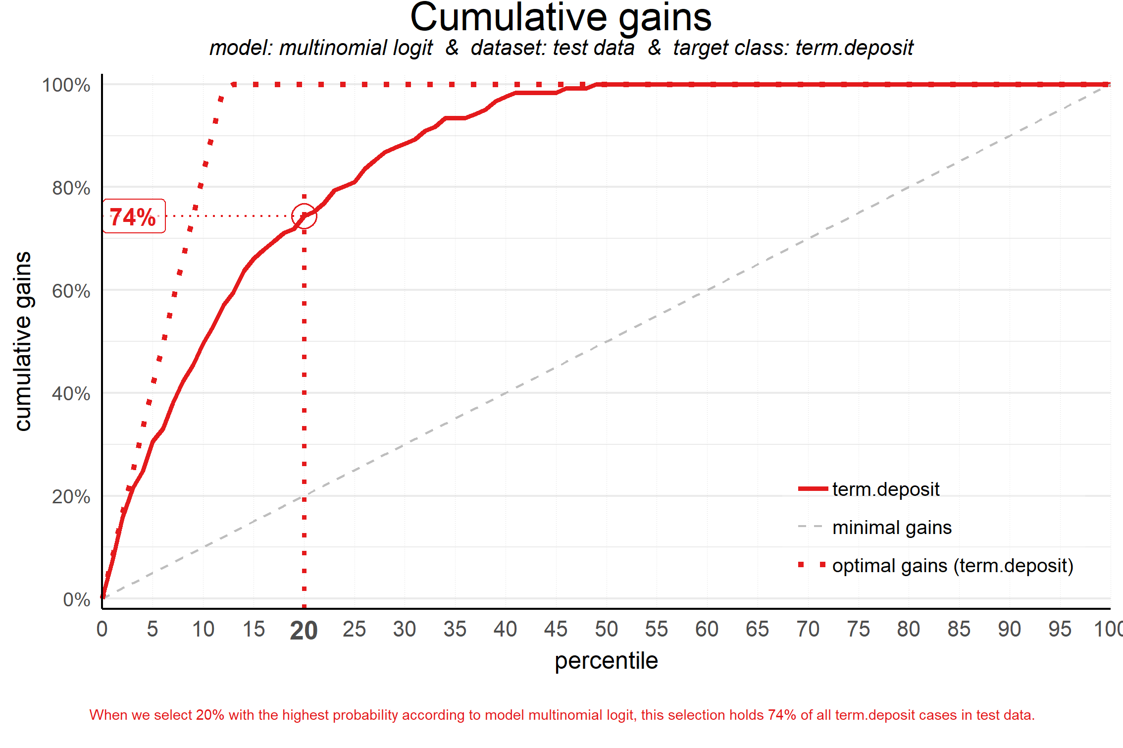
plot_cumgains(data = plot_input,highlight_ntile = 20)
##
## Plot annotation for plot: Cumulative gains
## - When we select 20% with the highest probability according to model multinomial logit, this selection holds 74% of all term.deposit cases in test data.
##
##
For financial plots (plot_costsrevs, plot_profit and plot_roi), the highlighing is added automatically, highlighting the optimum. If you want to highlight at another decile value, this can easily be done by setting the parameter (eg. highlight_ntile = 20).
With parameter highlight_how you can specify How to annotate the plot. Possible values: "plot_text","plot", "text". Default is "plot_text", both highlighting the ntile and value on the plot as well as in text below the plot. "plot" only highligths the plot, but does not add text below the plot explaining the plot at chosen ntile. "text" adds text below the plot explaining the plot at chosen ntile but does not highlight the plot.
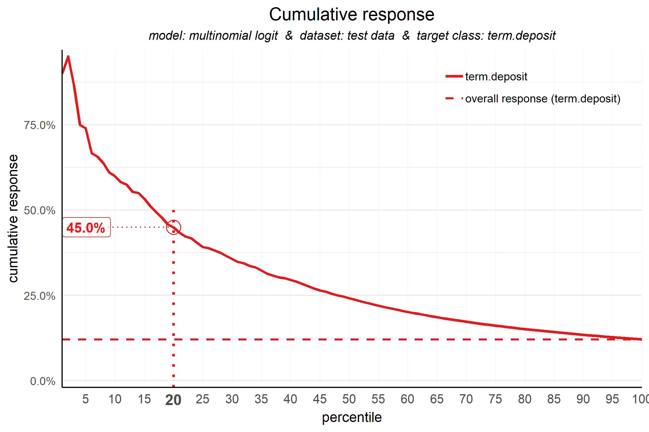
plot_cumresponse(data = plot_input,highlight_ntile = 20,highlight_how = 'plot')
##
## Plot annotation for plot: Cumulative response
## - When we select ntiles 1 until 20 according to model multinomial logit in dataset test data the % of term.deposit cases in the selection is 45.0%.
##
##
Customizing textual elements
All textual elements in the plots can be customized. To achieve this, first you have to create a list object with all default values for all textual elements. Modelplotr has a special function to build this list. Once the list is created, you can easily explore the defaults for all plots and change them to your will.
my_text <- customize_plot_text(plot_input=plot_input)
## List with default values for all textual plot elements is created.
## To customize titles, axis labels and annotation text, modify specific list elements.
## E.g, when List is named 'mylist', to change the lift plot title to 'Cumulatieve Lift grafiek', use:
## mylist$cumlift$title <- 'Cumulatieve Lift grafiek'
## plot_cumlift(custom_plot_text = mylist)
#explore default values for the cumulative response plot:
my_text$cumresponse
## $plottitle
## [1] "Cumulative response"
##
## $plotsubtitle
## [1] "model: multinomial logit & dataset: test data & target class: term.deposit"
##
## $x_axis_label
## [1] "percentile"
##
## $y_axis_label
## [1] "cumulative response"
##
## $response_refline_label
## [1] "overall response"
##
## $annotationtext
## [1] "When we select ntiles 1 until &NTL according to model &MDL in dataset &DS the %% of &YVAL cases in the selection is &VALUE."
#translate to Dutch
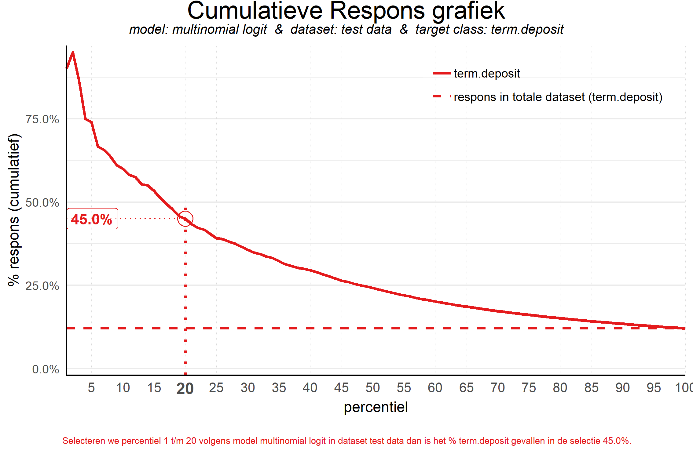
my_text$cumresponse$plottitle <- 'Cumulatieve Respons grafiek'
my_text$cumresponse$x_axis_label <- 'percentiel'
my_text$cumresponse$y_axis_label <- '% respons (cumulatief)'
my_text$cumresponse$response_refline_label <- 'respons in totale dataset'
my_text$cumresponse$annotationtext <- "Selecteren we percentiel 1 t/m &NTL volgens model &MDL in dataset &DS dan is het %% &YVAL gevallen in de selectie &VALUE."
As you can see, in the annotationtext you can take advantage of some placeholders starting with &. For details on available placeholders, see ?customize_plot_text.
Now, you can include the altered list in your plot function to use the custom plot element texts:
plot_cumresponse(data = plot_input,highlight_ntile = 20,custom_plot_text = my_text)
##
## Plot annotation for plot: Cumulatieve Respons grafiek
## - Selecteren we percentiel 1 t/m 20 volgens model multinomial logit in dataset test data dan is het % term.deposit gevallen in de selectie 45.0%.
##
##
Customizing colors
The colors of the value lines in all plots can be changed setting the parameter custom_line_colors= to a vector of strings, specifying colors for the lines in the plot. Both color names and color codes and RColorbrewer palet can be used. The vector is automatically cropped / expanded to match the required length. When not specified, colors from the RColorBrewer palet "Set1" are used.
# set scope to compare models, to have several lines in the plots
plot_input <- plotting_scope(prepared_input = scores_and_ntiles,scope = 'compare_models')
## Data preparation step 2 succeeded! Dataframe created.
## "prepared_input" aggregated...
## Data preparation step 3 succeeded! Dataframe created.
##
## Models "random forest", "multinomial logit" compared for dataset "test data" and target value "term.deposit".

#customize plot line colors with RColorbrewer
plot_cumgains(data = plot_input,custom_line_colors = RColorBrewer::brewer.pal(2,'Accent'))
## Warning in RColorBrewer::brewer.pal(2, "Accent"): minimal value for n is 3, returning requested palette with 3 different levels
## specified custom_line_colors vector greater than required length!
##         It is cropped to match required length
#customize plot line colors with color names / hexadecimal codes
plot_cumlift(data = plot_input,custom_line_colors = c('deepskyblue2','#FF0000'))
Saving plots
Saving plots can be done by setting the parameter save_fig = TRUE and/or by providing a filename for the plot (save_fig_filename = ). The plot name can include the path to the location where to save the plot (eg. 'C://TEMP//myplotname.png'). When no (location and) file name is specified, the plot is saved to a temporary directory (tempdir()) with the plot type as its name.
# save plot with defaults
plot_cumgains(data = plot_input,save_fig = TRUE)

# save plot with custom filename
plot_cumlift(data = plot_input,save_fig_filename = 'plot123.png')

# save plot with custom location
plot_cumresponse(data = plot_input,save_fig_filename = 'D:\\')

# save plot with custom location and filename
plot_cumresponse(data = plot_input,save_fig_filename = 'D:\\plot123.png')
modelplotr & Multinomial targets
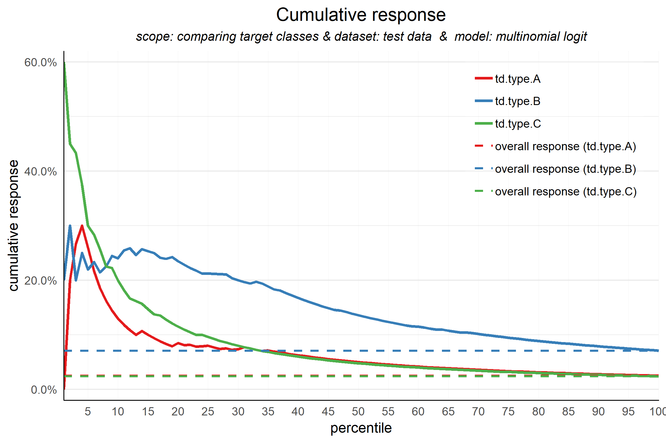
Modelplotr can also be used for a multinomial target. To illustrate this, let's build a model on the multinomial target in the data and plot the cumulative response chart. All functionality is the same, see above for details how to customize the plots.
# prepare data for training model for multinomial target td_type and train models
train_index =  base::sample(seq(1, nrow(bank_td)),size = 0.5*nrow(bank_td) ,replace = FALSE)
train = bank_td[train_index,c('td_type','duration','campaign','pdays','previous','euribor3m')]
test = bank_td[-train_index,c('td_type','duration','campaign','pdays','previous','euribor3m')]

# train a model
# setting caret cross validation, here tuned for speed (not accuracy!)
fitControl <- caret::trainControl(method = "cv",number = 2,classProbs=TRUE)
# mnl model using glmnet package
mnl = caret::train(td_type ~.,data = train, method = "glmnet",trControl = fitControl)
## Warning in load(system.file("models", "models.RData", package = "caret")):
## strings not representable in native encoding will be translated to UTF-8

# prepare data
scores_and_ntiles <- prepare_scores_and_ntiles(datasets=list("train","test"),
                      dataset_labels = list("train data","test data"),
                      models = list("mnl"),
                      model_labels = list("multinomial logit"),
                      target_column="td_type",
                      ntiles = 100)
## ... scoring caret model "mnl" on dataset "train".
## ... scoring caret model "mnl" on dataset "test".
## Data preparation step 1 succeeded! Dataframe created.

#generate input data frame for all plots, set scope at comparing target classes, leave out the 'no.td' class
plot_input <- plotting_scope(prepared_input = scores_and_ntiles,scope = 'compare_targetclasses',
                             select_targetclass = c('td.type.A','td.type.B','td.type.C' ))
## Data preparation step 2 succeeded! Dataframe created.
## "prepared_input" aggregated...
## Data preparation step 3 succeeded! Dataframe created.
##
## Target classes "td.type.A", "td.type.B", "td.type.C" compared for dataset "test data" and model "multinomial logit".

#plot
plot_cumresponse(data = plot_input)